
Switzerland · Breaksru GmbH · Branding · Creative Direction · Web Design
Breaksru GmbH Switzerland — Complete Brand Redesign, Website & Visual System
For Suzanne Ruf / Breaksru GmbH in Switzerland, I developed a complete visual reworking of the business: logo, corporate identity, color direction, custom icons, illustration, full website design and branded applications.
This was not a collection of isolated design jobs. It was a complete Creative Direction and business rebranding project, creating one consistent visual language across digital and physical touchpoints.
Project overview
- Client: Suzanne Ruf / Breaksru GmbH
- Market: Switzerland
- Year: 2019
- Project: complete visual rebranding and digital redesign
- Role: Creative Director · Graphic Designer · Illustrator · Web Designer
- Scope: logo · corporate identity · color system · iconography · illustration · website design · branded applications
- Production: Adobe Illustrator · Adobe Photoshop · Clip Studio Paint EX
A new identity for Breaksru
The redesign began with the core visual identity.
I developed a new logo around a lighthouse motif, giving Breaksru a strong central symbol that could carry into the wider corporate identity and digital system.
From there, the visual language expanded into color, icons, illustration and interface graphics rather than treating the logo as a separate design exercise.

Color script & art direction
A coordinated color system was developed to support the new identity across the website, illustrations and iconography.
The palette was used structurally: to distinguish sections, organise content and give the redesigned business a consistent visual rhythm.
This became part of the overall art direction, helping the new Breaksru identity feel coherent even when different types of content appeared across the site.

Full website design as part of the rebrand
The website was designed from the same visual foundation as the brand identity.
Instead of applying a new logo to an existing web structure, I developed the site’s look and feel together with its custom graphics, chapter illustrations, icons and color hierarchy.
This made the website one of the principal expressions of the new Breaksru identity rather than simply another place where the logo appeared.

A custom illustration system
The larger illustrations were developed specifically for different areas of the website.
They provided visual differentiation between subjects while remaining recognisably part of the same brand through palette, composition and drawing style.
This allowed illustration to become a functional part of the site architecture rather than simply decorative content placed between sections.
Custom iconography down to the interface level
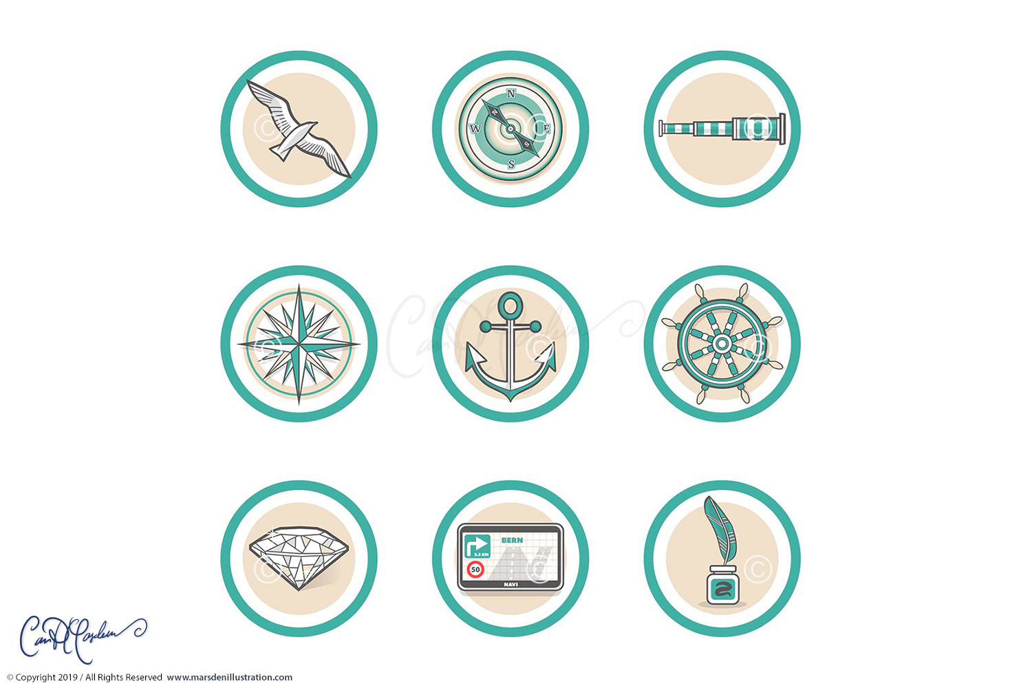
The project also included a purpose-built set of vector icons.
Rather than inserting a generic icon library into the website, the symbols were drawn to match the geometry, color system and overall tone of the new corporate identity.
These repeated small elements matter in a complete rebrand because they are encountered throughout the user experience. When designed consistently, they reinforce the identity without needing to constantly repeat the main logo.

Beyond the website — lanyards & branded applications
The redesign also extended into physical brand applications, including lanyard designs and other supporting materials.
This is where a complete identity system becomes particularly useful: the same color logic, graphic language and brand elements can move from the website into real-world touchpoints without looking like separate projects.
The objective throughout was a consistent Breaksru presence rather than simply a collection of individually attractive assets.

Vector design & digital painting
Different parts of the identity were produced with different tools according to their purpose.
- Adobe Illustrator: logo, iconography and scalable vector elements
- Adobe Photoshop: image development and digital painting
- Clip Studio Paint EX: custom illustration
This combination allowed the corporate elements to remain precise and scalable while giving the larger illustrations a more expressive character.
A complete visual relooking of a Swiss business
The Breaksru assignment went considerably further than a logo refresh.
It involved reconsidering how the company presented itself visually across almost every level of its communication:
- logo and corporate identity
- color script
- graphic language
- custom iconography
- illustration system
- full website art direction
- website design
- section and chapter graphics
- lanyards and supporting brand applications
That breadth makes the project a good example of my work in Creative Direction and multidisciplinary brand design for clients in Switzerland: one visual idea carried consistently from strategic identity decisions down to the smallest graphic details.
Creative Direction & design for Swiss companies
Breaksru is one of a number of projects I have developed for clients in Switzerland across branding, illustration, editorial work, digital communication and web design.
I work directly in German, English and French, which makes it possible to handle both the visual and communication aspects of multilingual projects without separating the creative process from the market in which the work will be used.
For Swiss companies, agencies and organisations, I can work on a focused assignment or take responsibility for a broader visual system such as the one developed here for Breaksru.
From brand refresh to complete visual system
Depending on the project, my work can include:
- Creative Direction
- brand refresh or complete rebrand
- logo design
- corporate identity
- color systems
- custom icon families
- illustration systems
- website art direction
- website design
- digital assets
- print collateral
- physical branded applications
Disciplines
- Creative Direction
- Brand Identity
- Logo Design
- Corporate Design
- Color Direction
- Icon Design
- Illustration
- Web Design
- UI Graphics
- Digital Art
- Print & Brand Applications
Related work & services
Graphic Design & Creative Direction →
Planning a brand refresh or complete visual redesign?
If your company needs more than a new logo — identity, color system, custom iconography, illustration, website art direction or a coordinated brand system — send me a short outline of the business, the current situation and what needs to change.