Top Source — Wine Label and Logo Design for Washington State Wines
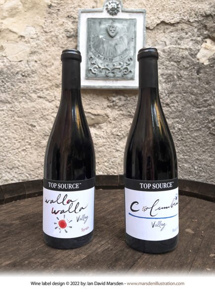
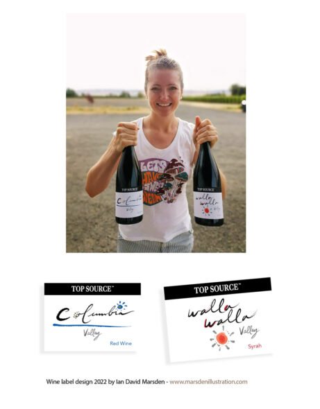
For Top Source, I created the logo and wine label designs for two Washington State wines: a Walla Walla Valley Syrah and a Columbia Valley Red Wine. The brief gave me a welcome degree of creative freedom, with a clear request to bring my own drawn line into the project rather than produce something polished into anonymity.
The result was a pair of labels that share a common identity but keep their own character: one built around the rhythmic, hand-drawn lettering of Walla Walla, the other around a more fluid treatment of Columbia, accompanied by small illustrative marks and restrained color accents. They belong together without behaving like twins, which is usually healthier in a wine range and in families generally.
A drawn identity for two distinct Washington wines
The labels were designed to feel direct, fresh and authored. Rather than relying on ornate heritage cues or the usual library of vineyard imagery, I worked with hand-drawn forms, open white space and a small number of carefully placed graphic details. The labels needed to stand comfortably on the bottle, read quickly, and still offer enough visual personality to be remembered after the first glance.
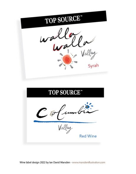
For the Walla Walla Valley Syrah, the repeated rhythm of the place name became the obvious starting point. I treated the words almost musically, allowing the lettering to carry the movement of the label. A small sun-like emblem and warm red-orange accents introduce a visual counterpoint without crowding the composition.
The Columbia Valley Red Wine label moves differently. Its lettering is broader and more sweeping, paired with a blue horizontal stroke and a compact floral-like mark. It has a calmer, cooler tone while remaining unmistakably part of the same Top Source family.
Wine label design with room to breathe
I tend to prefer packaging that knows when to stop. A wine label does not become more persuasive each time another ornamental device is added to it. These designs use a compact black header for the Top Source name, a large central lettering treatment, and a few small illustrative notes to establish tone. The compositions are light, but not empty; informal, but not casual in the careless sense.
The project was also a reminder that a label can carry personality without turning into a cartoon of itself. The linework is expressive, but the bottles still present as serious wines. I was fortunate enough to taste both, and they more than held up their end of the arrangement.
Project scope
- Logo design for Top Source
- Wine label design for Walla Walla Valley Syrah
- Wine label design for Columbia Valley Red Wine
- Custom lettering and illustrative graphic elements
- Packaging compositions prepared for print production
- Visual distinction between two wines within a shared brand system
Project credits
- Client: Top Source
- Wines: Walla Walla Valley Syrah and Columbia Valley Red Wine
- Region: Washington State, USA
- Creative direction, logo and wine label design: Ian David Marsden
Related wine label and packaging work
Further wine label projects include Roc de Couder for Mas de Figuier and Domaine Les Tuileries, two very different illustrated label commissions developed for French wine producers. More broadly, I work on packaging design, illustrated brand identities and commissioned visuals for print and product applications.
The Top Source wines can also be seen through Skurnik’s portfolio pages for the Walla Walla Valley Syrah and the Columbia Valley Red Wine.
Custom wine label and packaging design
I create wine label design, logo design and packaging illustration for producers and brands looking for a more individual visual language. Some projects call for an intricate illustrated world; others work better with a lighter hand and a few well-placed marks. The label should suit the wine, not merely announce that design has occurred.