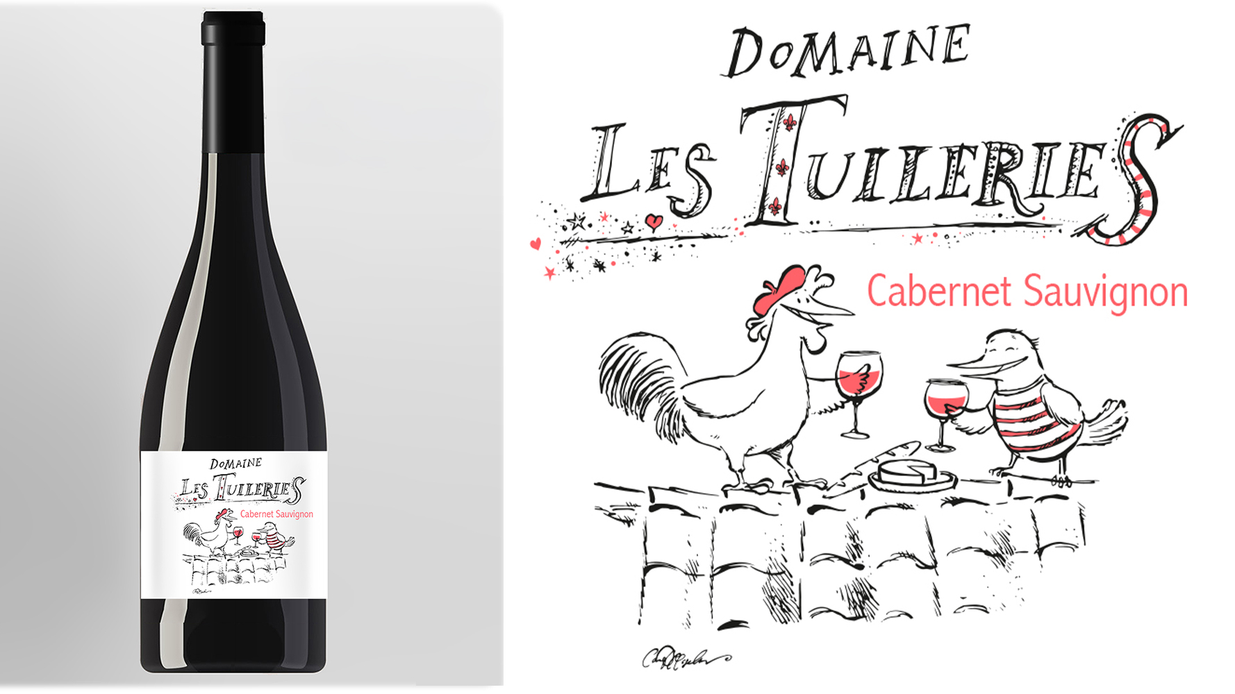
Domaine Les Tuileries — Hand-Drawn Wine Label Design and Winery Logo for the US Market
For Domaine de Coursac, a wine estate based in Carnas in the Gard, I created a complete illustrated label system and custom hand-drawn logo for Domaine Les Tuileries, a range of IGP Cévennes French wines developed for the American market.
The project brought together several things I have always enjoyed working with: drawing by hand, lettering that behaves like an illustration rather than a font choice, character-driven imagery, and packaging that is allowed to have a little personality. In this case, quite literally a rooster in a beret holding a glass of wine. One should know when not to resist a brief.
A French wine label, knowingly French
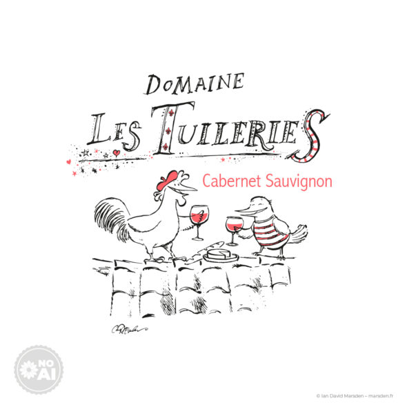
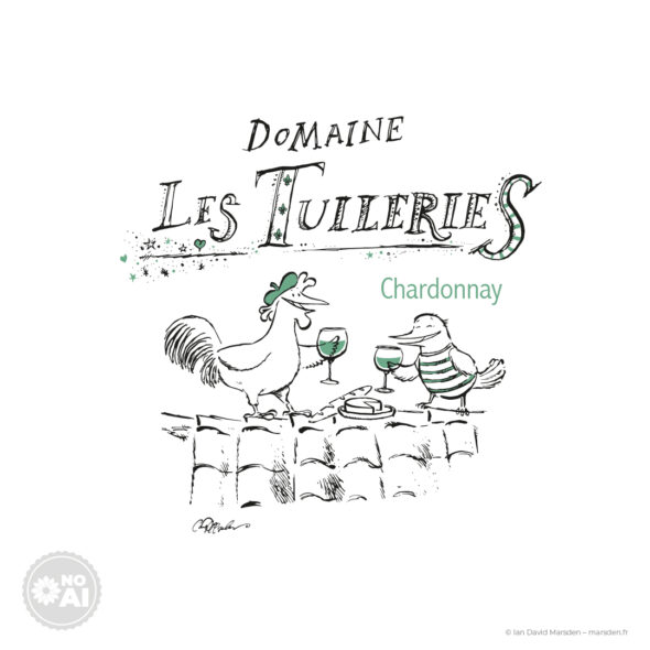
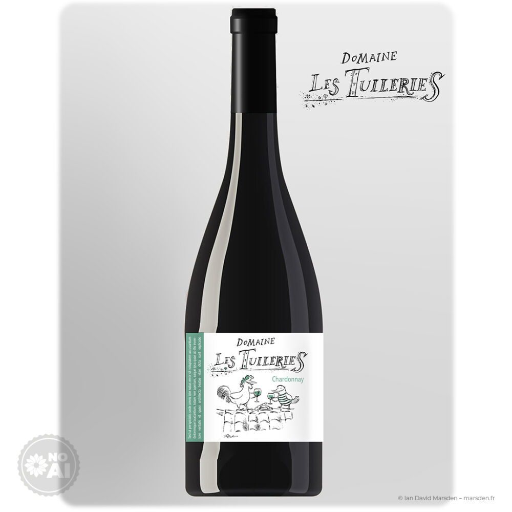
The name Les Tuileries suggested rooftops, tiles and a slightly elevated perch from which the characters could enjoy themselves. I developed a scene with two birds — a proudly sociable rooster and his smaller companion — sharing a bottle of wine on a tiled roof, with a baguette and a round of cheese placed between them.
Because the wines were destined for the US market, I chose to lean into a recognizably French visual vocabulary rather than pretend it was not there. The rooster, the marinière, the beret, the bread, the cheese, the glasses raised in mid-conversation: all are familiar signs. The work was in finding the right temperature. Too restrained and the label loses its charm; too emphatic and one wanders into souvenir-shop territory, a place from which not every bottle returns.
I was thinking less of postcard France than of the gently stylized world of older French cinema — a faint Jacques Tati spirit, perhaps — where props, posture and small social rituals do much of the comic work. The label needed to feel warm, humorous and inviting, but still carefully made. Tongue in cheek, certainly. Careless, no.
Dip pen, India ink and lettering drawn by hand
The entire visual language was developed in a hand-drawn style rooted in techniques I have used throughout my career: dip pen, India ink, black-and-white linework and custom lettering. The logo for Domaine Les Tuileries was not built from an existing typeface. It was drawn as an image in its own right, with irregular letterforms, small embellishments and a certain deliberate looseness that connects it to the illustration below.
I have always been drawn to illustrators and cartoonists for whom the line itself carries temperament — elegant when it needs to be, mischievous when allowed, never quite interested in behaving like vector geometry. This project gave that sensibility a very practical use. The label had to work commercially and in print, but it could still retain the humanity of the original mark-making.
The rooster and bird companion are treated with the same economy. Their expressions, gestures and poses do most of the storytelling. A glass raised slightly too proudly, a striped shirt, a beak caught somewhere between conversation and contentment: small things, but labels live by small things.
A coordinated label system for three wines
The label design was developed as a coherent system across three IGP Cévennes wines:
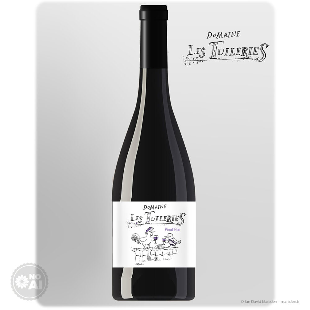
- Pinot Noir — with a restrained violet accent
- Chardonnay — with a green accent
- Cabernet Sauvignon — with a red accent
The base artwork remains largely black and white. Color is used sparingly: in the grape variety name, selected details in the logo, the characters’ accessories and the wine glasses. This keeps the hand-drawn line at the center while making the three bottles easy to distinguish as a family.
In the printed labels, metallic gold foil was added to the varietal names and selected graphic elements. It brings a subtle material accent to the bottles without changing the essential character of the design. The labels remain light and lively rather than ceremonially expensive, which suited the project far better.
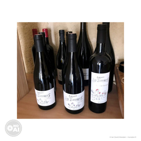
From illustrated concept to printed wine bottles
The finished bottles show why I still care about labels as physical objects. On screen, one judges a composition. On glass, one sees whether it has earned its place. The line must hold, the logo must read, the illustration must remain clear at bottle scale, and the print finish must support the drawing rather than bury it.
For Domaine Les Tuileries, the final result preserved the looseness of the original pen work while functioning as a practical wine packaging system. The produced bottles carry the same tone as the drawings: artisanal without becoming rustic shorthand, humorous without becoming novelty packaging, and French without shouting across the Atlantic.
Illustrated winery branding with a distinct hand
This project sits at the intersection of wine label design, packaging illustration, custom logo design and character-led visual identity. It also represents a type of commission I particularly enjoy: creating a bespoke visual world for a wine producer, one that feels authored rather than assembled from familiar premium cues.
For wineries, domains and beverage brands looking for something more individual than generic shelf polish, an illustrated label can carry a very specific tone — playful, historical, local, eccentric, elegant or quietly narrative — provided the idea is treated seriously even when the drawing has a smile in it.
Related work includes my French-language article on Roc de Couder, an illustrated wine label for Mas de Figuier in the Pic Saint-Loup, as well as broader work in business illustration and campaign visuals and logo design, mascots and character-based identities.
Project scope
- Illustrated wine label design for a three-bottle range
- Custom hand-drawn winery logo and lettering
- Character illustration and narrative label concept
- Packaging system for Pinot Noir, Chardonnay and Cabernet Sauvignon
- Color differentiation across the range
- Artwork prepared for print production and foil finishing
- Visual direction for a French wine brand developed for the US market
Project credits
- Client: David Codomié, Domaine de Coursac
- Brand / range: Domaine Les Tuileries
- Wine designation: IGP Cévennes
- Location: Carnas, Gard, Occitanie, France
- Market: Developed for the United States
- Year: 2018
- Medium: Dip pen, India ink, hand-drawn lettering, digital prepress
- Creative direction, illustration, logo and label design: Ian David Marsden
Bespoke wine label illustration and winery logo design
I create custom illustrated wine labels, winery logos, packaging artwork and character-led brand visuals for producers in France, Europe, the United States and internationally. Some projects call for restraint and quiet material elegance; others benefit from a more playful hand. The useful part is knowing which is which.