
Selected Projects
Case Studies
Selected projects showing how illustration, design, narrative, motion and visual systems have been used to solve specific communication problems.
Jump to a project
Hawlik · Henkel · IN TALENT WE TRUST / PPHO · iShepherd / TRM360 · Les Héritières de Bacchus · Mercedes-Benz · Mycotrition · Parc Le Duc · Pillage autour du Pic · Sanafort · Seele / Oskar · Smoony / FIS · Software Engineering Essentials · Strategic Wealth Creator · SUSTAIN-D · Volkswagen / SEDRIC
Project Case Studies
2021 · Explainer Films · Visual Storytelling · Animation
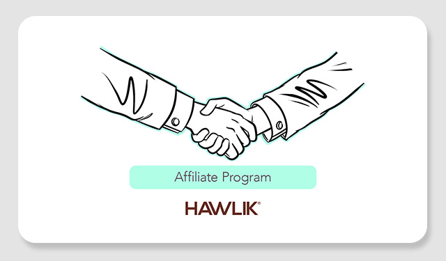
Hawlik — Ten Illustrated Explainer Films
Client: Hawlik Gesundheitsprodukte GmbH · 2021
Role: Illustrator · Visual Storyteller · Storyboard & Visual Development · Production & Animation · English Translation & Voiceover
Ten short illustrated films turning technical information about mushroom cultivation, laboratory testing, product composition, sustainability and commercial communication into clear visual sequences. I developed the illustration style, storyboarded the films and handled the complete production and animation.
Project scope & deliverables
- Series development: Interpretation of the supplied technical scripts, scene breakdowns, visual metaphors and storyboards for ten short films on cultivation, analytics, product composition, sustainability, expertise and the affiliate program.
- Visual language: Clean black linework, selective watercolor-style color and a coordinated title-frame system, with mint title bars maintaining continuity across the ten subjects.
- Cultivation and origin: Illustrations of Chinese highland growing environments, farmers, mushroom species, substrates, growth media and maturation, including comparisons with wine and cheese to explain ripening time.
- Analytics and quality control: Laboratory scenes and explanatory graphics for ingredient measurement, residue monitoring, batch certification and traceability from cultivation in China to independent analysis in Germany.
- Product and process explanation: Visual comparisons of fruiting bodies and cultivation medium; powder, capsules, extracts and liquid extracts; polysaccharides, chitin, hot-water extraction and concentration.
- Sustainability and partnerships: Scenes explaining irrigation, sun drying, recycling and company operations, alongside grower expertise and the affiliate program’s purchasing, order-forwarding and recommendation models.
- Film production and English editions: Complete production and animation of all ten films, with English script translation and English-language narration performed by Ian David Marsden.
Product Communication · Information Design · Illustration
Henkel — Product Illustration Series
Client: Rock Brasiliano GmbH for Henkel · July 2015
Role: Illustrator · Information Designer · Infographic Artist · Visual Communicator
Product visuals and explanatory diagrams created for cleaning and hygiene communication across packaging, instruction material, point-of-sale applications and multilingual use.

Project scope & deliverables
- Product application diagrams: Step-by-step instructional sequences for Bref, General and WC Frisch cleaning products, using recurring gloved hands, buckets, tanks and bowls to explain dosage, placement, brushing and preparation.
- Cutaway and close-up illustration: Cross-sections of toilet bowls and tanks showing flushing action, water flow and fragrance release, with arrows and magnified details explaining the action inside the product environment.
- Cleaning mechanisms: Explanatory scenes showing limescale, bacteria and dirt being dissolved or removed; visual treatment of active agents and client-supplied claims, including the 24 H symbol.
- Benefit and category iconography: A modular vocabulary of circular benefit icons, bubbles, foam and shine effects, with variants for anti-limescale, anti-bacterial, active-gel and muscle-power products and floral or spiral fragrance motifs.
- Vector production: Artwork drawn entirely in Adobe Illustrator with shading gradients and structured layers; final EPS and AI files prepared for Henkel’s print and packaging teams.
- Localization and format adaptation: Reusable application visuals and icons designed for regional print adaptation and scaling across packaging, instruction leaflets, point-of-sale material and large trade visuals.
- Agency collaboration: Illustration and information design commissioned by Rock Brasiliano via dieKleinert, developed from Stephan Eisenblätter’s visual briefings, sketches and art direction.
Character Design · Information Design · Corporate Communication · Motion
IN TALENT WE TRUST — PPHO Visual Communication
Client: IN TALENT WE TRUST / WEBER SAS, Paris · March 2024–March 2025
Role: Illustrator · Character Designer · Information Designer · Visual Communication & Motion
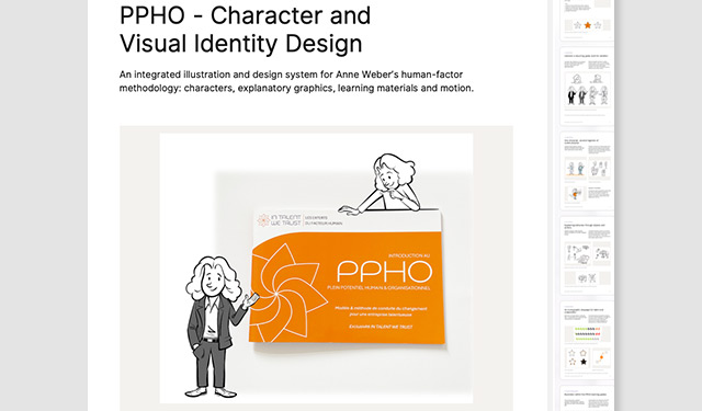
An integrated illustrated system for Anne Weber’s PPHO methodology. I developed Léonard, an original recurring character, alongside visual metaphors, team-dynamics diagrams, information graphics, learning-guide illustrations, digital assets, a campaign poster and drawing animation.
Project scope & deliverables
- Original character system: Design and development of Léonard, with consistent silhouette, facial structure and gesture vocabulary across business, casual and scientific clothing, seated poses, expressions and professional roles.
- Conceptual illustration: Explanatory spot illustrations and visual metaphors for interaction, comfort, action and experimentation, including tools, a Renaissance flying machine and the Vitruvian breaking-free sequence.
- Team dynamics and cooperation: Rowing-team diagrams using repeated figures, direction, participation and selective color to make alignment, disengagement and collective effort visible.
- Talent and performance graphics: Star-based diagrams, expressive symbols and directional cycles explaining talent restriction and expansion, adaptation and performance within Anne Weber’s PPHO framework.
- Editorial illustration assets: Illustrations for the four PPHO pillars and print-ready artwork used beside methodological text in the learning guides, with restrained linework and limited color suited to publication size.
- Digital and presentation assets: Character illustrations, conceptual drawings and information graphics supplied for website integration and presentations, extending the same visual vocabulary from print into digital communication.
- Campaign illustration and motion: Hand-drawn and digitally painted I want you to change the world poster, retaining the client’s orange accent, plus a motion-graphic drawing video showing the image developing.
- Attribution: PPHO methodology by Anne Weber. My contribution was creative direction of the illustrated visual system, character design, illustration and information design; I did not design the PPHO booklet or the website.
SaaS · UI/UX · Brand System
iShepherd AG — TRM360 Brand Identity & UI/UX System
July 2019 – August 2020
Role: Creative Director · Visual System Designer · UI/UX Designer · Illustrator · Brand Identity Designer
A visual and interface system for the TRM360 platform, combining brand identity, illustration, interface concepts, diagrams and character-based communication.

Project scope & deliverables
- Corporate identity: Primary logo based on the shepherd-and-radar metaphor, animated product mark, horizontal and vertical variants, Brand Bible covering typography, spacing, tone and palette, plus stationery and business-card layouts.
- TRM360 dashboard UI/UX: Adobe XD interface design for an identity and access management compliance-analytics platform, with role-specific dashboards, layered navigation, entitlement-data views, access filters, tooltips and sorting.
- Role and access visualization: Color-coded interface variants for line managers, auditors, GRC officers and IT administrators, with role-specific icons and support for light and dark modes.
- 64 custom vector icons: A semantically organized screen icon set covering actions such as approve and revoke, risk states, connected systems including AD, CMDB and HRIS, and user or entity roles.
- Illustrated product metaphors: Gameboard visualization of user paths and policy checkpoints, compliant and non-compliant sheep, and a rocket-powered sheep mascot for promotional applications.
- Sales and investor communication: Investor slide decks, sales one-sheets, onboarding flows, audit and integration infographics, downloadable radar reports and giveaway artwork for patches, stickers and keychains.
- Company homepage and creative direction: Structure and design of the initial WordPress homepage, including wireframes, UX flow, messaging, navigation, contact and compliance sections and mobile-responsive layouts, coordinated with the wider brand and product system.
Event Graphics · Visual Identity · Illustration
Les Héritières de Bacchus — Wine Fair Visual Identity
Client: Les Héritières de Bacchus, Claret, France · 2015–2022
Role: Visual Identity Designer · Illustrator · Event Graphic Designer · Production Artist
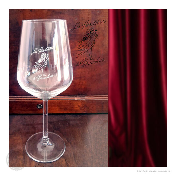
An original illustrated identity for a wine fair dedicated to women winemakers in the Pic Saint-Loup region. The figure was adapted across posters, screen-printed tasting glasses, embroidered textiles and promotional vehicle graphics.
Project scope & deliverables
- Illustrated visual identity: Original fine-line vector figure inspired by classical Greek imagery, combining a flowing dress, vine leaves, grapes and a raised glass with script lettering and a wine-red accent.
- Logo variants: Color, monochrome and tinted versions of the figure and name, retaining the delicacy and legibility of the linework across small and large applications.
- Event posters: Poster design for selected editions, including the documented 2015, 2017 and 2018 posters; composition and information hierarchy for dates, venue, program, admission and partners.
- Tasting-glass artwork: Artwork for screen-printed admission and collector glasses, adapting the figure for a curved transparent surface while keeping its fine line readable; documented applications include 2015 and 2018.
- Textile application: Logo artwork for embroidery on jackets, where the identity was reproduced in gold thread.
- Vehicle-wrap production: Vector artwork for all four faces of the promotional vélo-taxi, composed within the operator’s template with attention to scale, safe areas, cutting zones and the vehicle’s curved body.
- Print and fabrication files: Print-ready artwork prepared for production and fitting, including side and rear vehicle panels carrying the figure, lettering and practical event information.
Corporate Communication · Comics · Training
Mercedes-Benz — Business mit Stil
Client: Mercedes-Benz AG via Sieber & Wolf GmbH · 2010–2015
Role: Illustrator · Character Designer · Visual Communicator · Visual Storyteller
A large sequential illustration project for the Mercedes-Benz employee Mitarbeiterknigge, translating etiquette, workplace conduct and customer interaction into recognizable situations and characters. Book design and art direction were by Sieber & Wolf; my role was the illustration.

Project scope & deliverables
- Employee-handbook illustration: More than 120 vector illustrations for Business mit Stil – Ihr Erfolg im Zeichen des Sterns, translating workplace conduct and customer-service expectations into readable scenes for the Mitarbeiterknigge.
- Recurring cast: Customers, sales and service staff and colleagues of different ages, roles, body types and cultural backgrounds; posture, eye contact and gesture carry the instructional message.
- Behavioral scenarios: Illustrations covering showroom welcomes, empathetic complaint handling, email etiquette, greetings, handshakes and conduct at company events and ceremonies.
- Brand-specific drawing system: Hand-drawn Adobe Illustrator vectors made on a Wacom Cintiq, using a custom brush style and brand-aligned palette, with accurate vehicles, uniform details and dealership interiors.
- Multilingual production: Wordless instructional visuals, a reusable character library and modular assets for localization and different formats, with final artwork prepared for multilingual editions and CMYK and Pantone printing.
- Related museum commission: A separately commissioned A4 Mercedes-AMG Petronas Formula One cutout sheet for young visitors to the Mercedes-Benz Museum in Stuttgart, combining printable parts with an instructional layout.
- Agency attribution: Dedicated illustration and character design in collaboration with Sieber & Wolf; handbook layout, book design and art direction were by the agency.
2018 · Explainer Films · Illustration · Multilingual Production
Mycotrition — Six Mushroom Explainer Films
Client: Mycotrition GmbH · 2018
Role: Illustrator · Storyboard Artist · Motion Graphics Designer · Voice-Over Director
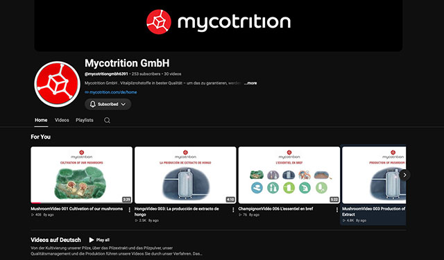
Six illustrated explainer films covering mushroom cultivation, processing and product quality. Supplied texts were developed into storyboards, digitally painted watercolor-style illustrations and animated sequences, with the complete series produced in German, English and French.
Project scope & deliverables
- Six-film development: Adaptation of supplied technical texts into concept sketches and storyboards covering cultivation, mushroom powder, mushroom extract, quality management, finished-product manufacture and a concluding overview.
- Painted illustration library: Dozens of digitally painted watercolor-style scenes spanning forests, growing environments, landscapes, figures and mushrooms, with a consistent calm visual treatment throughout the series.
- Manufacturing process graphics: Technical slides drawn from actual production photographs and manufacturer diagrams, including harvesting, crushing and milling, water treatment, extraction vessels and spray-drying equipment.
- Quality and production sequences: Illustrated analysis and chromatography, batch destinations, certification and documentation, followed by drum loading, hopper filling, encapsulation, capsule sorting, blister packing and jar labeling.
- Motion-graphics production: Animation of layered illustration elements, camera movements and fades, taking the approved visual sequences through to finished films of approximately two to six minutes each.
- Multilingual editions: Six films each in German, English and French, with language-specific title cards; a separate published playlist also presents the films with Spanish subtitles.
- Voice production coordination: In-person supervision of German recordings with Kaspar Eichel in Berlin and French recordings with Daniel Beretta in Paris, plus coordination with voice agencies and studios; English narration by David A. Watson.
Environmental Graphics · Map · Signage
Parc Le Duc — Orientation Map, Signage & Icons
November 2018 – present
Role: Designer · Illustrator · Environmental Graphic Designer · Visual Communicator
An orientation and wayfinding system developed from architectural plans for a holiday park near Pic Saint-Loup, combining a detailed illustrated map, custom icons and multilingual-ready signage.

Project scope & deliverables
- Master orientation map: Redrawing of the client’s black-and-white technical site plan as a fully vectorized illustrated map, retaining chalet positions, numbered plots, roads and utility locations from the bureau d’études source.
- Sector maps: Localized detail maps of residential and amenity areas, with color-coded emergency markers for hydrants, RIA fire-hose connections and defibrillators.
- Bespoke iconography: Custom navigation and emergency pictograms drawn from scratch, together with chalet illustrations and a compass rose; no stock icon set or template was used.
- Trilingual wayfinding: French, Dutch and English labels and welcome messages, bringing guest orientation and safety information into the same system for the park’s Dutch-speaking and international visitors.
- Environmental graphics: Entrance totem panels combining park branding, map overview, welcome text and safety symbols, plus directional signage for facilities including the bar-restaurant and pool.
- Color and information hierarchy: A coordinated system based on Dutch orange, with consistent typography, color coding, line weights and text hierarchy designed for orientation and visibility at a distance.
- Large-format production: Adobe Illustrator vector artwork prepared for large-format printing, with CMYK and Pantone-matched colors and organized files supporting ongoing updates, multilingual versions and reuse.

Board Game · Illustration · Art Direction
Pillage autour du Pic — Illustrated Board Game
Client: L’esprit du Pic productions · August–November 2024
Role: Art Director · Game Designer · Illustrator
Complete visual development for a fantasy board game inspired by the Pic Saint-Loup region. I designed the game rules and developed the art direction and illustrations, including characters, map artwork, cards, icons and packaging.
Project scope & deliverables
- Game design and art direction: Game rules and gameplay design for an adventure treasure hunt set around Pic Saint-Loup, with art direction connecting the region’s geography and folklore to the game’s visual structure.
- Original character cast: Hand-drawn development of Lady Araignée, Laurent le Rouge, Dona Flora and Zephyr, each with a distinct silhouette, expression and palette suited to printed cards and gameplay.
- Illustrated card system: Full-color location, map, event and action cards, supported by custom icons and infographics; location cards depict the vineyard, olive tree, chapel and cross.
- Terrain-map board: Illustrated regional landscape integrating navigable routes, discovery zones, vineyard rows, olive groves, ruins and caves, with a color-coded legend and action areas.
- Rulebook information design: Illustrated turn sequences, component diagrams, custom infographics and an icon legend explaining play within the same graphic system as the cards and board.
- Box and promotional artwork: Box-cover illustration featuring the central cast, treasure and Pic Saint-Loup silhouette, with packaging artwork and advertising visuals extending the image into promotion.
- Manufacturing delivery: Print-ready vector and raster production files for the box, board, card sets and rulebook, taking the commission from early concepts to artwork ready for manufacture.
Creative Direction · Brand Identity · Packaging
Sanafort AG — Creative Direction, Brand & Packaging
Client: Sanafort AG, Switzerland · 2014–2018
Role: Creative Director · Brand Identity Designer · Packaging Designer · Visual Systems Designer · Illustrator · Motion Graphics Designer
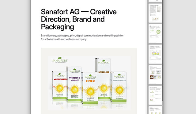
A four-year creative-direction and visual-system project for a Swiss health and wellness company. The work connected corporate identity, packaging, production artwork, catalogs, product literature, campaigns and web communication in one recognizable visual language.
Project scope & deliverables
- Company-wide creative direction: Visual communication from 2014 to 2018, working directly with the CEO, product managers, medical advisors, printers and production partners across identity, packaging, print, digital and film.
- Brand identity system: Serif wordmark, stylized ginkgo emblem, supporting typography, green palette and Kunden-Garantie trust seal, with secondary elements and consistent product-presentation conventions.
- Packaging architecture: A coordinated vitamin and mineral range using a radiant sun motif and controlled product colors, extended across capsule cartons, Calcium and Magnesium stick sachets and their folding boxes.
- Packaging production: Folding-box artwork with dielines, cut and fold guides, tabs, bleed, panel rotation and information zones, plus preproduction 3D box mockups and product-presentation images.
- Product information design: Modular layouts for ingredient and nutrition tables, dosage guidance, article numbers, prices, comparisons and legal copy, keeping dense changing content legible across packaging and literature.
- Catalogs and sales literature: Cover and interior design for the 16-page 2017 vitamin and mineral catalog, wider product catalogs, flyers, sell sheets, leaflets, range overviews and retail communication, including the Hawlik mushroom range.
- Campaigns and digital communication: Illustrated mailings, newsletters, retail posters and seasonal offers, alongside responsive corporate website design and digital product presentation using the same identity and information hierarchy.
- Connected film commission: Six Mycotrition explainer films associated with Hawlik product communication: text adaptation, storyboards, watercolor-style illustration, motion graphics and in-person supervision of German and French narration recordings.

Safety Communication · Mascot Design
Seele GmbH — “Oskar” Safety Mascot
October 2012 – February 2013
Role: Character Designer · Illustrator · Visual Communicator
A recognizable safety character developed for workplace communication, signage and multilingual training within a specialist architectural façade company.
Project scope & deliverables
- Safety character development: Original Oskar construction-worker character, with and without a high-visibility vest, maintaining a consistent white helmet, gray workwear, expressive gestures and approachable visual tone.
- Hazard and procedure illustration: Site-specific scenes covering forklifts, personal protective equipment, welding, chemical handling, noise, lifting, glass handling, crane operations, suspended loads and fall prevention.
- Behavioral safety communication: Clear contrasts between correct and incorrect behavior, showing unsafe procedures and equipment misuse through a Behavior-Based Safety approach to the illustration.
- Non-verbal narrative design: Simple image-led layouts and universal symbols designed to communicate across language barriers and different reading levels on multilingual construction sites.
- Scenario development: Sketching, storyboarding and scene construction for individual hazard illustrations and sequences, keeping the character reusable across safety, signage and training contexts.
- Training and signage applications: A coherent scene library for printed training guides, job site signs, onboarding material, safety campaigns, posters and presentation slides.
- Vector delivery: Scalable Adobe Illustrator artwork prepared for print and digital production, commissioned through the dieKleinert illustration agency for Seele GmbH.

Event Branding · Character Design · Licensing
Smoony — Official Mascot of the FIS Alpine World Ski Championships 2003
Client: St. Moritz 2003 Organizing Committee · 2002–2003
Role: Character Designer · Illustrator · Visual Branding Consultant
Beginning with a schoolchild’s winning competition sketch, Smoony was developed into a professional character system for merchandise, signage, licensing and event promotion, with production assets suitable for TV animation and large-format reproduction.
Project scope & deliverables
- Mascot development: Professional development of the winning Engadin school-contest drawing into Smoony, preserving the original sun-and-moon idea while creating a complete, reproducible official event character.
- Finished character artwork: Color mascot artwork and orthographic views establishing the hybrid sun and crescent-moon figure, red ski suit and white Swiss cross for consistent reproduction.
- Action-pose system: Ski-themed jumping and downhill poses carrying the championship emblem, designed for signs, posters and promotional applications beyond the standing mascot.
- Small-format vector variants: Simplified vector versions adapted for small merchandise such as keychains and pins, retaining recognition when the full character detail could not be reproduced.
- Licensing and merchandise files: Licensing-ready artwork for toys, apparel and souvenirs, supplied with the production files needed by event and merchandise partners.
- Broadcast and large-format assets: Production artwork suitable for TV animation and large-format reproduction, supporting the character’s use across event branding and promotion.
- Visual branding consultation: Development in close contact with the organizing committee and its branding partners, carrying the school-drawing concept through to the official mascot and its production system.

Technical Education · Illustration · Product Design
Software Engineering Essentials Deck
Client: Audiger EURL, Montpellier · 2025
Role: Creative Director · Visual System Designer · Illustrator · Character Designer · Iconographer · Packaging & Production Lead
A 60-card training deck designed to make software-engineering principles easier to navigate, remember and discuss. The system combines character anchors, technical iconography, information hierarchy, packaging and a coherent visual taxonomy.
Project scope & deliverables
- Four-domain visual taxonomy: Color, character, icon and layout conventions for Clean Code and Object-Oriented Design, Architecture and Component Design, Development Processes and Team Practices, and Testing and Quality Assurance.
- Mnemonic character system: The green Sprite, red Robot, blue Wizard and yellow Inspector, designed as category anchors for navigation, recognition and recall across the 60-card curriculum.
- 60 instructional illustrations: A distinct visual metaphor or scene for every card, using clean digital linework and domain-specific color to support technical discussion at card size.
- Card layout and information hierarchy: A modular front-and-back grid with image and text zones, domain labels, titles and hierarchical typography, accommodating the client’s written material, code examples and technical notes.
- Iconography and specifications: Four geometric domain icons supplied as SVG and PDF sets, with typography and color specifications connecting cards, documentation and packaging.
- Étui packaging and prepress: Custom card-box design from dieline through fold, cut and glue annotations to offset-production files, with CMYK conversion and color-managed PDF/X-4 delivery.
- Reusable production assets: Structured, layered Adobe Illustrator source files, print-ready PDFs and PNG and JPEG exports, with individual illustrations supplied for presentations, advertising and social media.
- Content attribution: Training curriculum and instructional text by Loïc Audiger; my contribution was the visual system, character design, illustration, card layouts, packaging and production artwork.

Executive Learning · UX · Information Design
Strategic Wealth Creator System™
Client: Executive Learning Systems, Inc., United States · 2017
Role: Creative Director · Illustrator · Visual Systems Designer · Information Designer · UI/UX Concept Designer
An integrated visual and interface system designed to turn complex business strategy into a navigable executive-learning environment. The project combined identity, information architecture, instructional illustration, diagrams and a simulated handheld interface.
Project scope & deliverables
- Program identity: Hexagonal SWCS brand mark with six surrounding nodes, produced in color and monochrome for learning materials, executive presentations and printed publications.
- Seven-module architecture: A distinct color and geometric marker for each kit: holistic overview, business, future, internal, ecosystem and leadership drivers, then diagnostic and strategic roadmap, with shared icons, navigation labels and legends.
- Learning-interface concept: A simulated handheld console framing the program’s slides, with a vertical navigation column, active-module marker, progress indicators and a central area for diagrams and illustration.
- Instructional illustration: Character-led business scenarios, visual metaphors, leadership archetypes and narrative scenes interpreting the client’s strategic and financial concepts for executive learning.
- Narrative guide: An illustrated representation of co-creator Carlos Dias, used within selected modules to guide participants through the material.
- Analytical information design: Leadership-behavior matrices, strategic roadmaps, financial-performance tables, diagnostic worksheets, business-driver charts and organizational-capability frameworks developed from the client’s concepts.
- Integrated learning assets: Consistent identity, console frame, module coding and drawing style across diagrams, illustrations and screens, with production-ready assets for printed materials, presentations and digital learning formats.

Public Outreach · Comics · Sustainability
SUSTAIN-D — Energy-Saving Comics
2025
Role: Illustrator · Character Designer · Visual Storyteller · Creative Direction
Two-panel comics designed to communicate energy-conscious behavior without depending on written language. Some panels include numerals and short labels where they help the message.
Project scope & deliverables
- Character design: Creation of Foxy, an expressive fox encountering everyday energy dilemmas, and Major Domo, a robot companion offering practical alternatives, with warmth and recognition across housing demographics.
- Scenario development and visual scripting: Creative direction, scenario ideation, storyboards, layout and pacing for two-panel strips: an inefficient habit in the first panel and an energy-smart alternative in the second.
- Comfort and lighting topics: Scenes addressing thermostats, heating and cooling, room ventilation, night-time temperatures, shutters, daylight and responsible use of electric lighting.
- Household routines: Visual explanations of water-saving habits, showers and faucet use, indoor and outdoor laundry drying, efficient cooking, vacation energy reduction and standby-power or cable disconnection.
- Accessible visual narrative: Image-led storytelling designed to work without written narrative for residents with different languages and reading levels; numerals and short labels remain where useful, including temperatures and month names.
- Print and digital production: Final Adobe Illustrator vector artwork and A4 printable layout templates for distribution and display, structured as a modular system for print and screen.
- Social-housing context: Development with Marie Fedou and Sustain-D’s Pôle Habitat for energy-awareness work supporting housing providers, local authorities and residents, including low-energy buildings.
Mobility · Storyboards · Concept Art
Volkswagen SEDRIC — Concept Art
Client: CMV Cross Media Verlag GmbH for Volkswagen · May 2018
Creative direction: Barbara Kürten
Role: Illustrator · Concept Artist · Storyboard Visualizer
Eleven concept illustrations developed from CMV’s supplied, pre-approved storyboard for Volkswagen’s SEDRIC journalist tour and CEBIT media event, delivered as layered PSD files and flattened RGB and CMYK JPEGs for presentation, print and screen.

Project scope & deliverables
- Eleven-image presentation sequence: Finished concept illustrations for the Volkswagen SEDRIC journalist tour and CEBIT media event, translating CMV’s supplied, pre-approved storyboard into a coherent visual sequence.
- Automotive and architectural accuracy: Consistent depiction of SEDRIC, locations, figures and spatial relationships across Autostadt Wolfsburg, Potsdam, waterfront venues and exhibition interiors.
- Presentation and exhibition scenes: Illustration of the CEBIT stand concept, the Nightlife interior-theme display and the covered vehicle before its unveiling, followed by studio photography and a Volkswagen group scene.
- Line-and-wash treatment: Hand-drawn linework rendered digitally with restrained watercolor-style color overlays, combining isometric diagrams, bird’s-eye views and cinematic compositions; a black-and-white line-art key image was also produced.
- Digital illustration workflow: Artwork developed primarily in Adobe Photoshop using a Wacom Cintiq and Clip Studio Paint, maintaining consistent perspective, color and vehicle details across the series.
- Production delivery: Layered PSD source files and flattened RGB and CMYK JPEGs, delivered sequentially for CMV’s event-presentation material and prepared for presentation, print and screen.
- Creative attribution: Concept illustration and storyboard visualization under Barbara Kürten’s creative direction at CMV Cross Media Verlag; the narrative framework and storyboard were supplied by the agency.
Browse by Discipline
Looking for a Particular Kind of Work?
The portfolio and service pages contain broader selections beyond these individual case studies.
Clients Across Different Contexts
These case studies represent only part of the client history. The wider client page includes international companies, publishers, agencies, institutions, cultural organizations, NGOs and regional businesses.

New Work
Have a Project to Discuss?
If your project involves illustration, visual communication, characters, information design, publishing or motion, send me a short outline of what you need and where the work will be used.