Sanafort AG — Complete Creative Direction, Brand Identity, Packaging Design and Multi-Channel Visual System
From 2014 to 2018, I served as Creative Director for Sanafort AG, a Switzerland-based health and wellness company developing nutritional supplements, vitamin products, medicinal mushroom ranges and associated consumer communication for an international market.
This was not a single branding commission, nor a limited packaging assignment. It was a complete, long-term creative directorship. I was responsible for shaping and executing the company’s visual world from the ground up: corporate identity, logo design, packaging systems, print-ready product artwork, catalogs, flyers, sell sheets, campaign materials, customer mailings, newsletters, digital communication, responsive website design, product presentation visuals and the visual direction of a multilingual explainer-video program.
I worked directly with the company’s CEO, as well as product managers, medical advisors, printers and production partners. The Sanafort project is one of the clearest examples of how I work when a client needs more than isolated design assets: a coherent brand system, developed with strategic oversight and carried through into the smallest technical detail.
The company no longer exists, but the design work remains a substantial case study in creative direction, packaging design, brand architecture, regulated product communication and multi-channel graphic design.
Related service overview: Graphic Design & Creative Direction
A Swiss health and wellness brand designed as one complete visual ecosystem
Sanafort required a visual identity that could communicate several qualities at once. It needed to feel Swiss, precise and credible, but not austere. It had to speak to health, scientific care and product reliability, while still remaining approachable to consumers. It also had to function across a broad and growing range of materials: tiny dosage tables, folding-box dielines, magazine-style catalogs, promotional inserts, seasonal campaigns, web pages, product photography, animation and sales literature.
The central task was to create a design system with enough character to be memorable and enough discipline to remain coherent under pressure. Nutritional products generate large amounts of mandatory, semi-technical and often changing information. Product names, quantities, active ingredients, nutritional values, tables, legal copy and explanatory text all compete for space. The work had to make these elements readable and orderly without reducing the products to bureaucratic packaging.
That balance became the guiding principle of the project: high-quality design that could withstand complexity.
Creative direction from A to Z
My remit for Sanafort covered essentially the entire creative expression of the company. With the exception of a small number of third-party, non-Sanafort product boxes the company also distributed, I designed the visual materials for the brand from A to Z.
- Corporate logo and supporting brand identity
- Visual positioning for the company and its product families
- Trust marks, seals and secondary brand assets
- Packaging systems for vitamin, mineral and wellness products
- Product-specific color logic across SKUs and ranges
- Folding-box dielines, gabarits and production-ready vector artwork
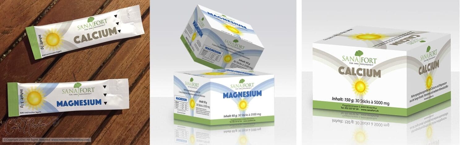
- Stick sachet packaging and related product formats
- Catalog covers, internal catalog layouts and product comparison pages
- Flyers, posters, sell sheets and product information sheets
- Seasonal promotions, illustrated mailings and direct-response pieces
- Newsletter and mailblast design
- Responsive website design and digital product communication
- Product presentation visuals, packshots and branded composites
- Creative direction for a multilingual explainer-video series in German, English and French
The role demanded not only visual invention, but consistency, stamina and an unusual degree of production awareness. A brand system is only convincing when it continues to work under revision. Sanafort involved changing formulations, changing tables, new products, new print formats, sales needs, promotions and international communication. The design had to be elastic without becoming loose.
The corporate identity: a clear brand mark with a natural, premium tone
The Sanafort corporate logo became the foundation for the wider identity. I designed a refined serif wordmark paired with a stylized botanical leaf form, supported by the line Für Ihre Gesundheit. The green palette and elegant letterforms were intended to communicate health, trust and quality without lapsing into visual clichés of either pharmaceutical coldness or rustic “natural product” informality.
The identity needed to work at very different scales: printed small on packaging, enlarged on catalog covers, placed on promotional mailings, used in digital header spaces and repeated across product renders, sell sheets and campaign artwork. It had to remain unmistakable and composed wherever it appeared.
Alongside the wordmark, I developed the Sanafort Kunden-Garantie seal, a trust badge designed to support customer reassurance in the company’s direct-response and product literature. It was conceived as a credible extension of the brand rather than a decorative sticker: structurally simple, legible at small sizes and visually compatible with the core identity.
Packaging design as brand architecture
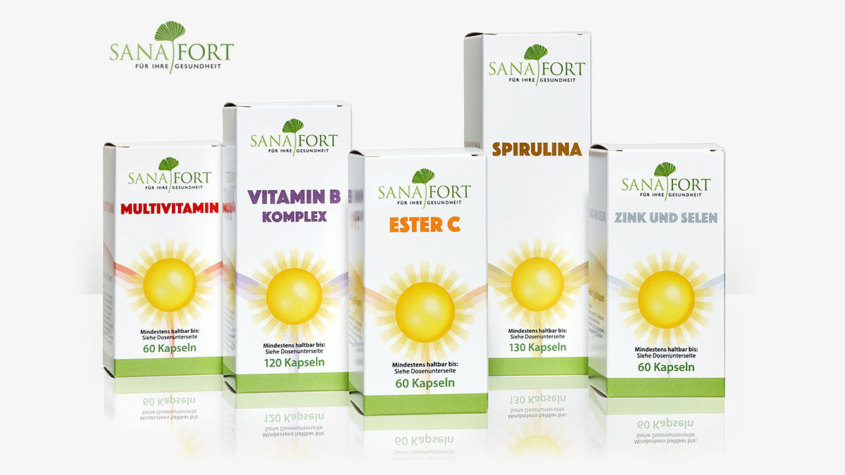
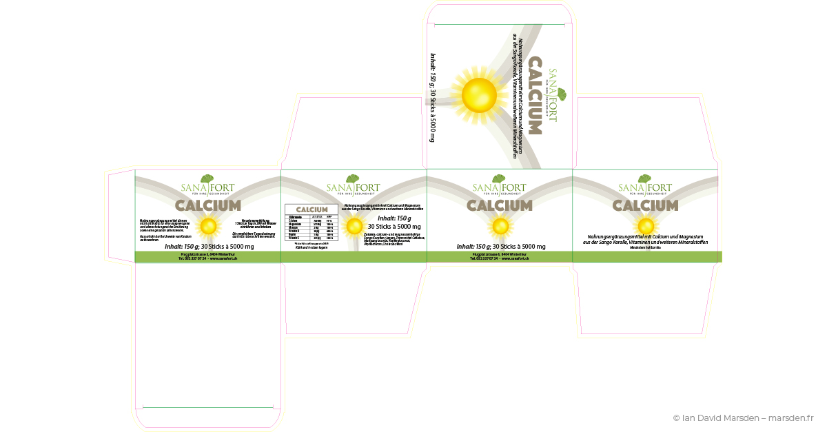
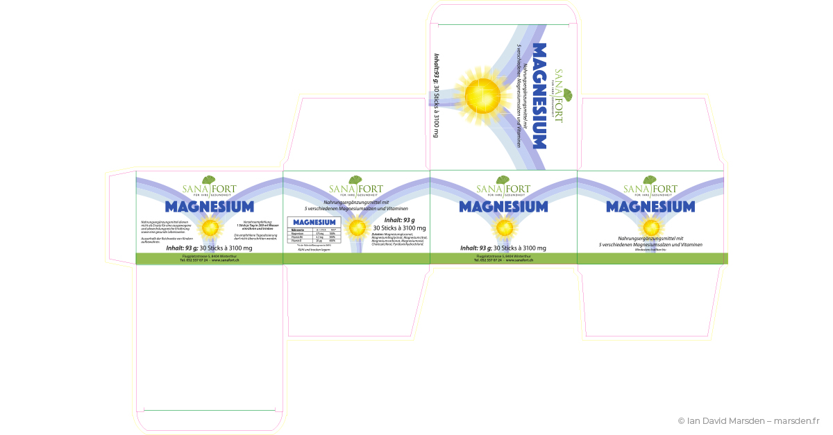
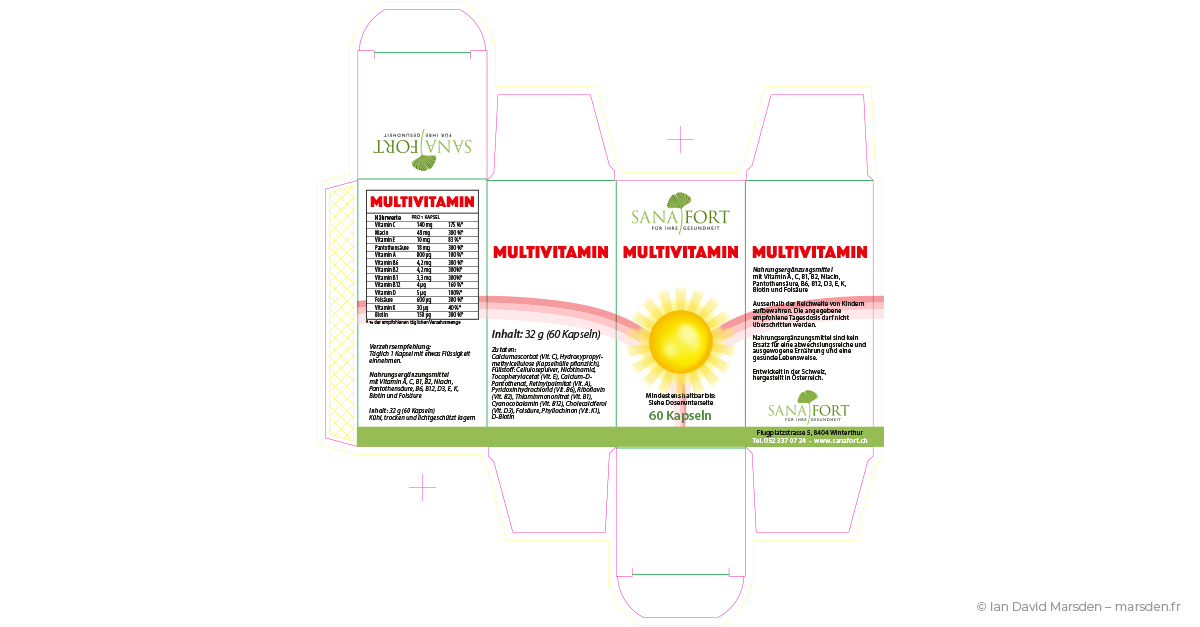
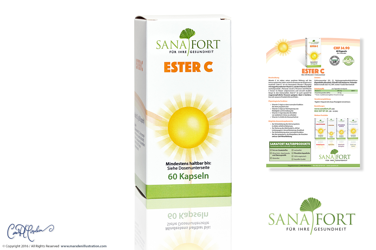
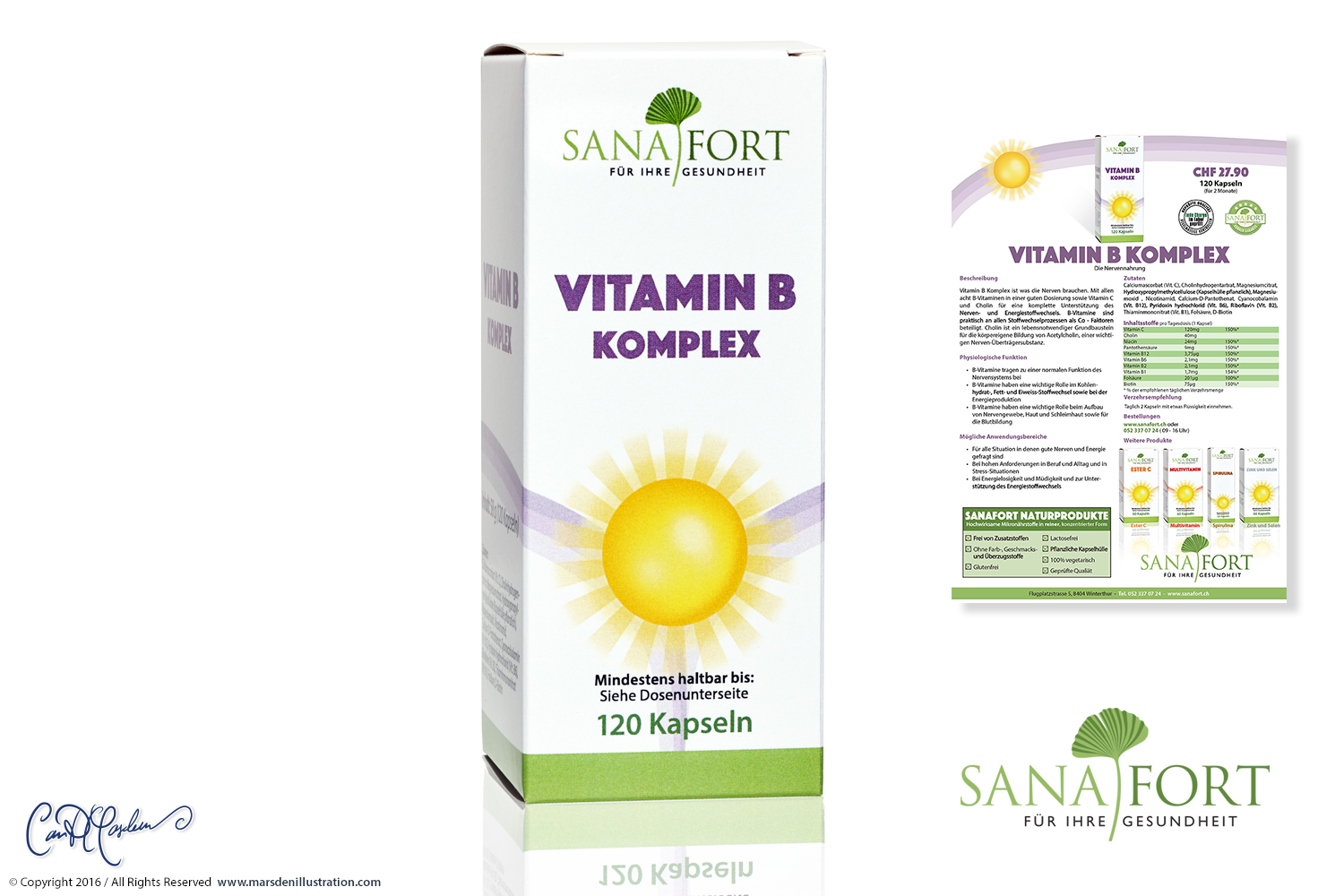
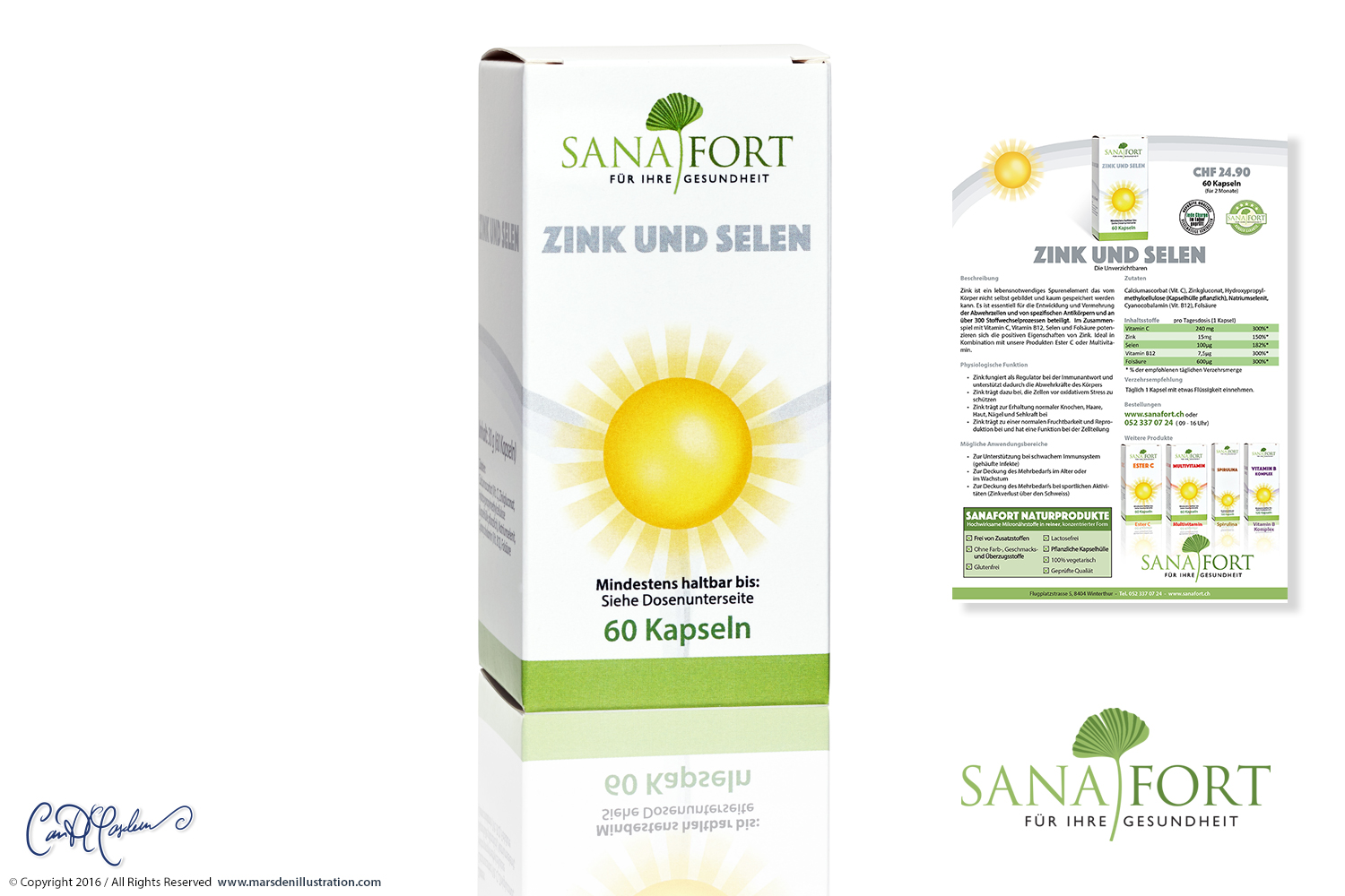
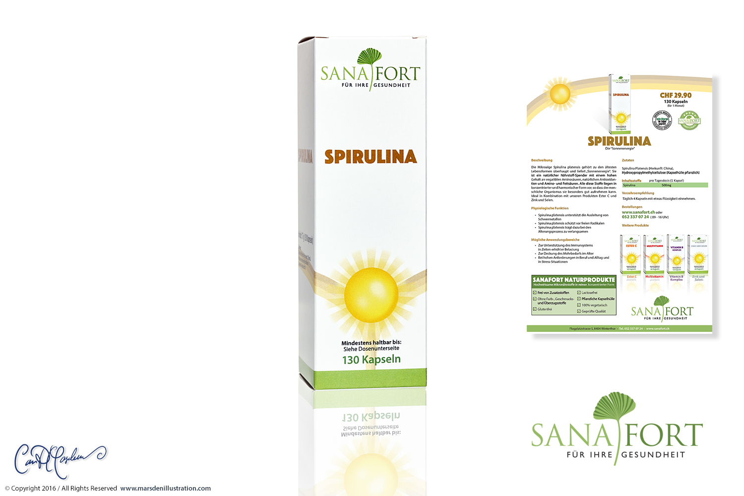
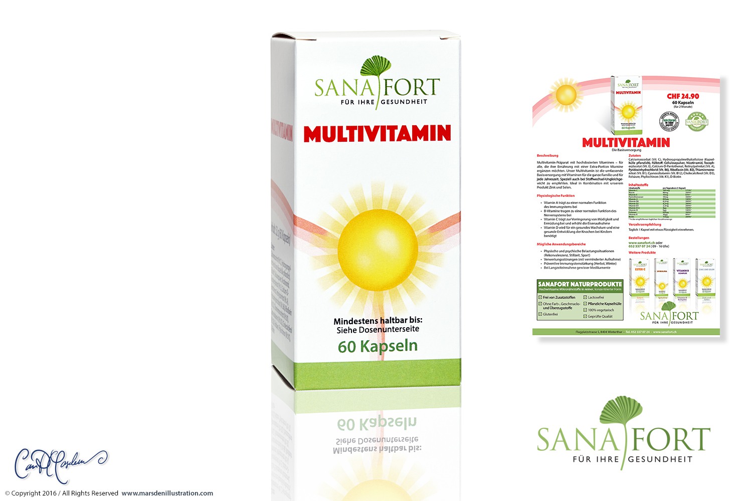
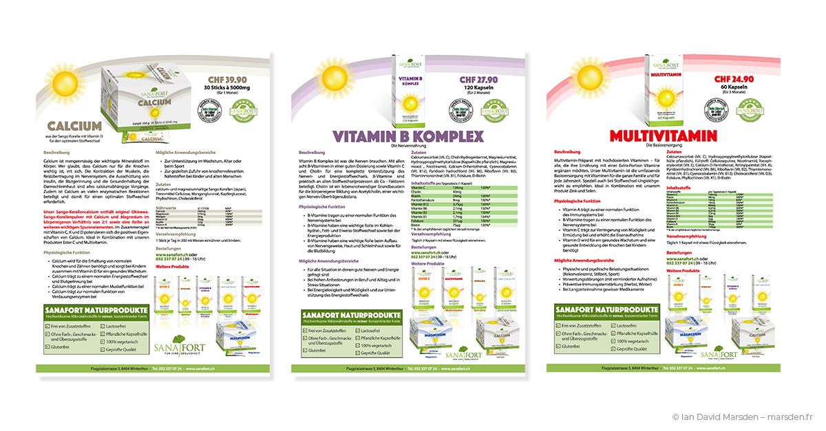
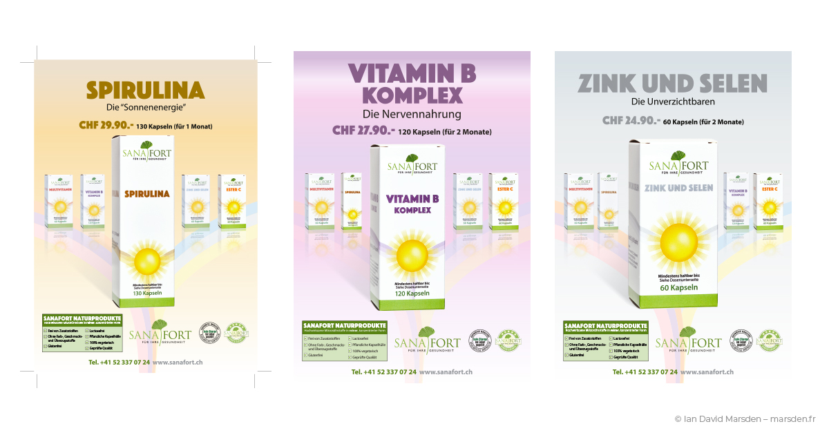
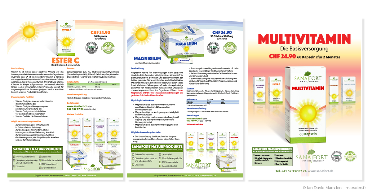
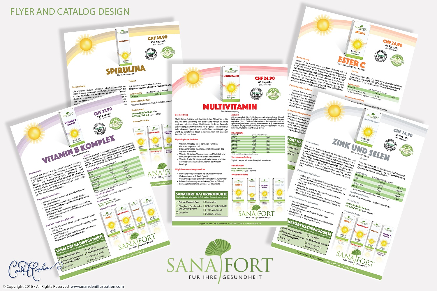
The main vitamin and supplement range became the most recognizable expression of the brand. I developed a packaging system built around a radiant sun motif and soft ribbon-like color bands that crossed the front of each box. This created a visual language that suggested energy, clarity and health while giving the range a strong, repeatable shelf identity.
Within that system, each product received its own carefully controlled color: red for Multivitamin, violet for Vitamin B Komplex, orange for Ester C, warm gold for Spirulina, cool grey-blue for Zink und Selen, and coordinated tones for further products such as Calcium and Magnesium. This was not arbitrary surface variation. It was a deliberate color architecture that allowed customers to distinguish products quickly while preserving a coherent family structure.
Every package had to perform several tasks at once. It had to present the product confidently, carry a sizeable amount of legally and commercially relevant information, remain printable and structurally sound across box formats, and connect visually to catalogs, flyers and digital product pages. I designed the boxes with that entire chain in mind.
The result was a scalable supplement packaging system: one clear brand expression, applied across numerous SKUs, compatible with technical constraints and adaptable as the product range evolved.
Dielines, gabarits and print-ready production artwork
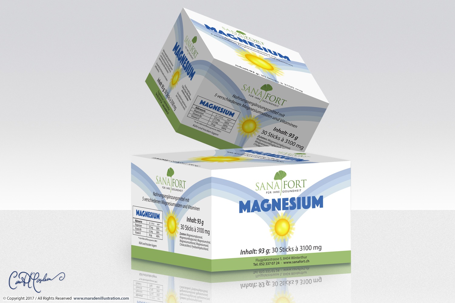
Packaging design is often shown in portfolio form as a tidy front-facing mockup. The more consequential work happens behind it: the dielines, bleed, cut and fold structures, side panels, tabs, correct rotations, copy zones, alignment across panels and the small practical decisions that determine whether a design actually survives production.
For Sanafort, I created print-ready folding-box artwork for multiple products, including detailed dielines for box formats such as Calcium, Magnesium and Multivitamin. These layouts incorporated all necessary panels, brand elements, ingredient tables, product titles, dosage information and printer-facing specifications.
The technical discipline of this work mattered. A product system of this kind is not successfully designed when the front panel looks attractive; it is successfully designed when every panel works, when revisions can be made without collapsing the structure, and when the artwork moves into production with confidence.
Pack presentation, product visuals and sales-ready imagery
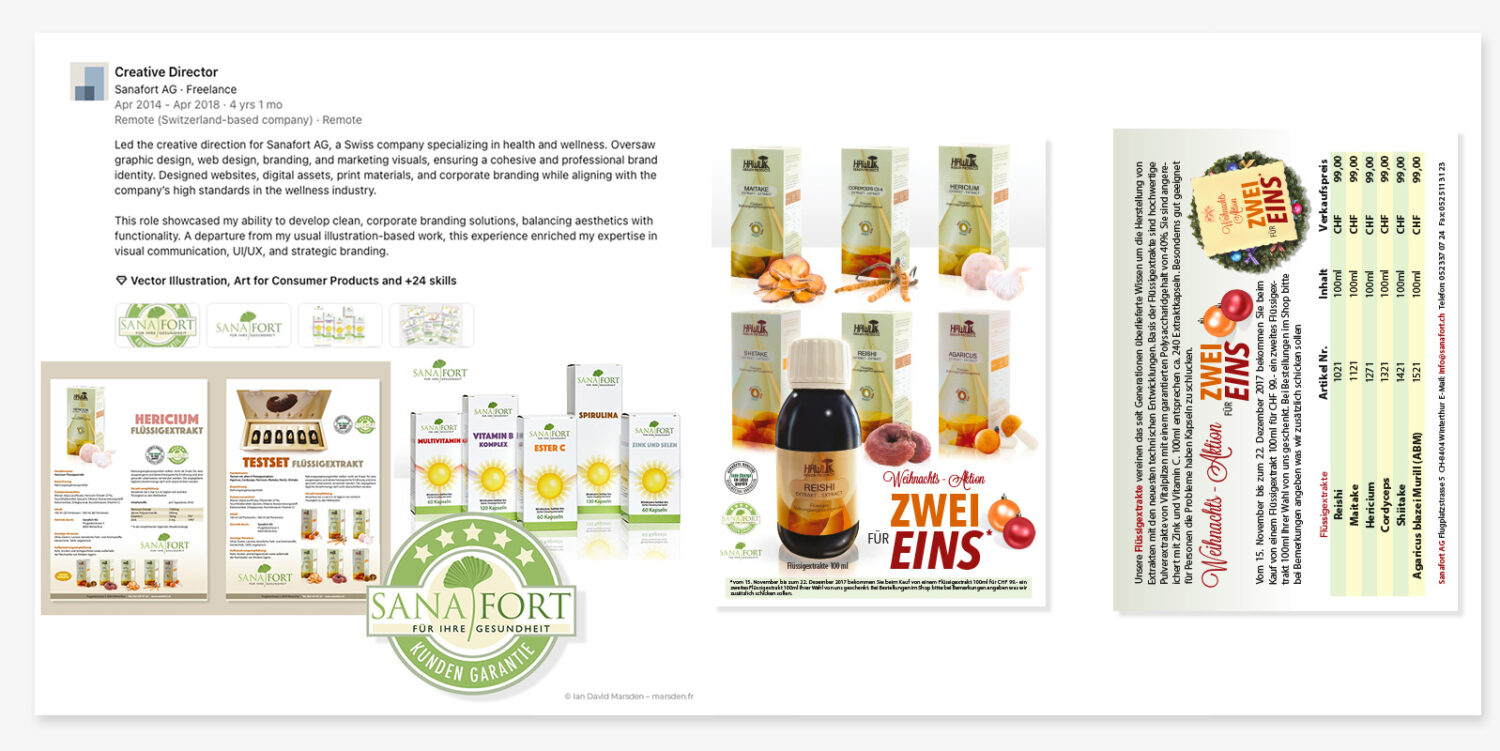
In addition to the flat packaging artwork, I created polished product presentation visuals and composited packshots used in sales literature, product communication and visual overviews. These included individual render-style presentations for products such as Calcium, Magnesium, Multivitamin, Vitamin B Komplex, Ester C, Spirulina and Zink und Selen.
These images were part of the wider design system. A box visible in a catalog, on a product flyer or in a promotional composite had to preserve the same brand atmosphere as the physical packaging itself. The objective was not mere decoration, but continuity across every customer-facing presentation of the product.
Dense product information, ingredient tables and regulated communication
A large part of the Sanafort work involved information design. The company’s products required precise ingredient tables, dosage guidance, nutritional information, article numbers, pricing, product comparisons and explanatory text. These elements varied from product to product and were sometimes subject to revision as formulations, requirements or sales structures changed.
Designing this material well means respecting its density. It cannot be treated as an afterthought or squeezed into a layout once the more glamorous branding is finished. The tables are part of the design. The reader’s eye must be guided through headings, measurements, descriptions, purchase information and benefit statements without losing orientation.
For Sanafort, I developed a structured approach to these information-heavy pages. Table formatting, line spacing, column logic, product labels, price areas and explanatory blocks were organized to remain readable and consistent, while still belonging to the brand’s visual world. The task was to make detailed product communication feel clear, not burdensome.
Catalog design and editorial product communication
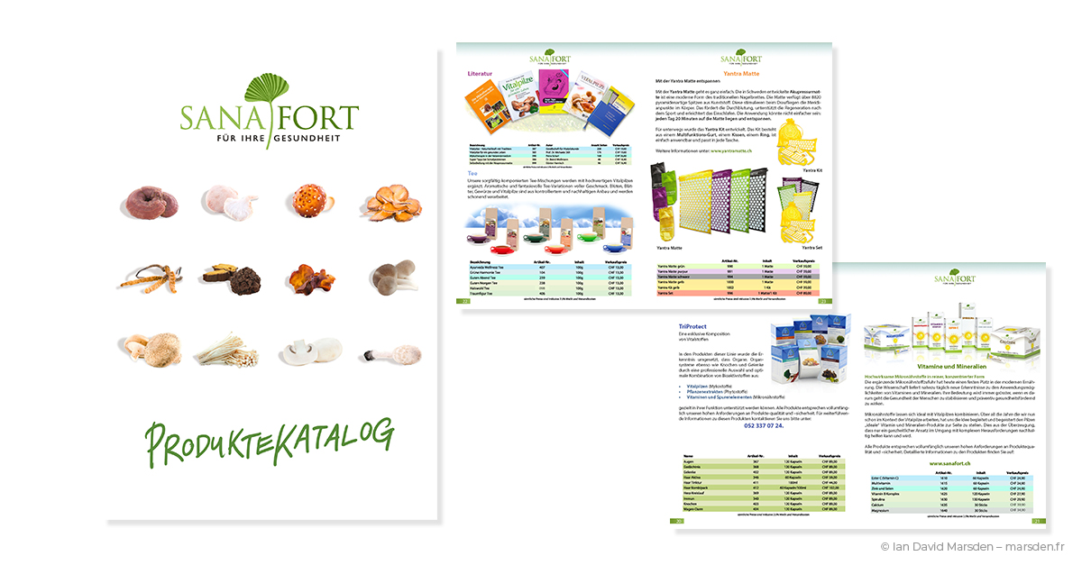
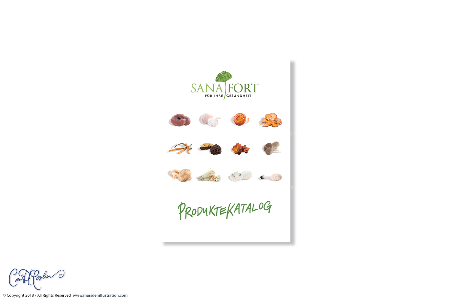
One of the larger print pieces developed for Sanafort was the 16-page vitamin and mineral product catalog. It brought together brand positioning, introductory content, product pages, catalog architecture, sales logic and detailed product information in a single publication. The catalog needed to work for distributors, sales partners and end customers alike: professional enough for B2B contexts, but clear and inviting for consumers.
I designed the cover, page hierarchy, internal product spreads, product presentation logic and supporting editorial layouts. The visual system carried across letters from the company, product explainers, individual sell pages and range overviews. The work combined catalog design, brochure design, editorial structure and product marketing.
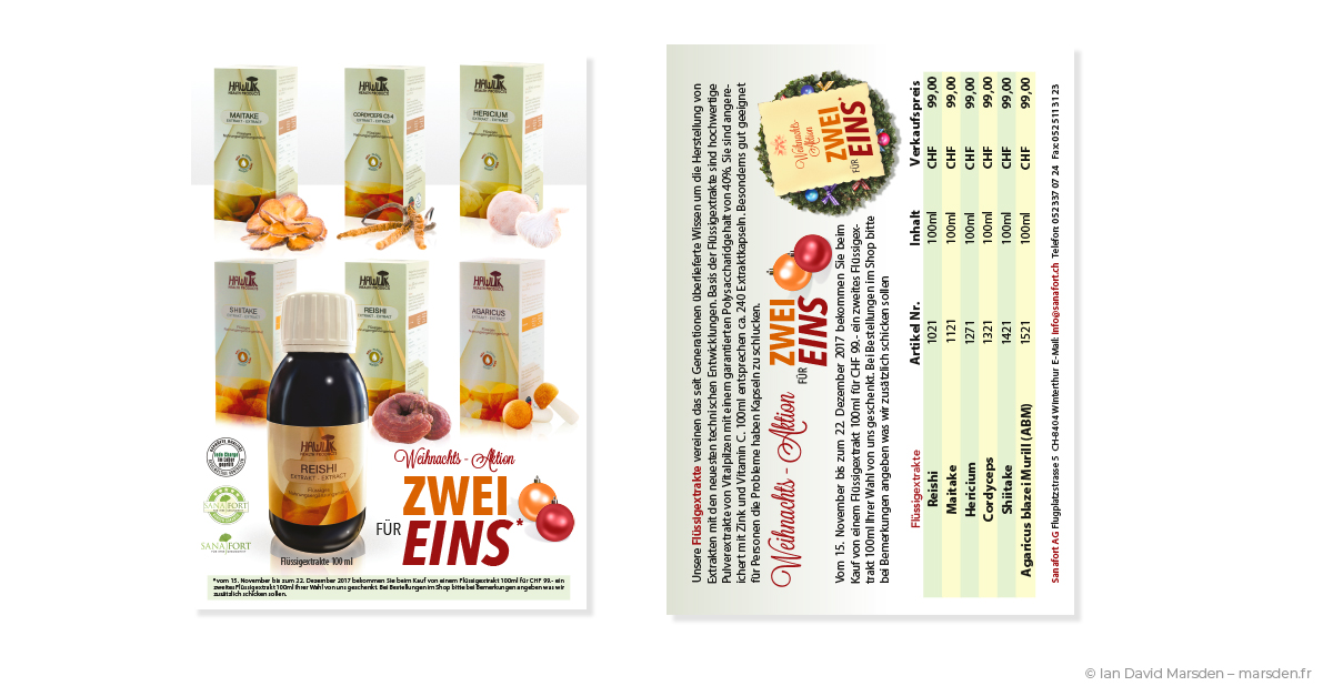
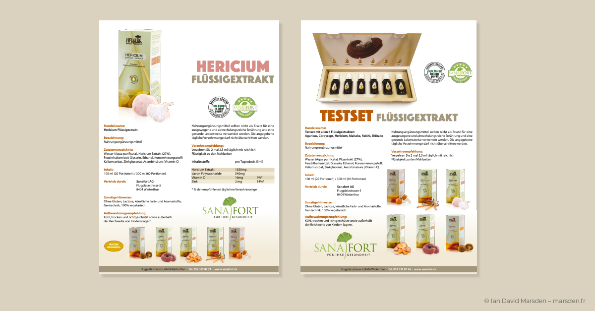
I also created pages for Sanafort’s medicinal mushroom line, including products such as Reishi, Cordyceps, Hericium, Shiitake, Agaricus, Maitake and others. These pages required a different atmosphere from the vitamin range: more botanical, more ingredient-led, but still unmistakably part of the same company communication.
Flyers, sell sheets and B2B product communication
Alongside the catalogs, I designed a substantial series of one-page and two-page product communications: sell sheets, product flyers, information leaflets and comparison materials. These were essential tools for product presentation and sales support. Each had to summarize a product efficiently, combine pack imagery with persuasive but precise information, and maintain visual consistency with the surrounding brand.
The Sanafort product flyers often paired a strong product name and packshot with extended descriptive copy, ingredient tables, benefit sections, dosage guidance, quality markers and contact information. The layouts were deliberately modular, allowing product-specific details to change while preserving the underlying structure.
This part of the project demonstrates an area of graphic design that I value highly: the ability to make commercial information attractive without making it vague.
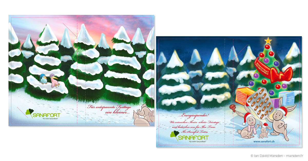
Campaign design, mailings and seasonal promotions
The Sanafort identity also had to live in more promotional, time-sensitive formats. I designed seasonal campaigns, customer mailings, direct-response inserts, postcards, illustrated holiday communication and offer-driven promotions such as the “Zwei für Eins” campaign.
These pieces needed a slightly different emotional temperature from catalogs and packaging. They had to be warmer, more immediate and sometimes more playful, while still sitting comfortably inside the Sanafort visual language. The Christmas mailings and illustrated inserts allowed me to bring narrative illustration into the brand in a way that added charm without weakening the company’s health-and-quality positioning.
I also designed newsletter and mailblast visuals, ensuring that the company’s direct communication retained the same hierarchy, brand consistency and product clarity as the printed materials.
Website design and digital brand experience
The Sanafort system extended beyond printed communication into a fully responsive corporate website and wider digital product presentation. I designed the online brand experience to echo the identity established in packaging and catalogs: clean, structured, easy to navigate and visually reassuring.
The website had to serve several purposes at once. It needed to introduce the company, communicate product values, present supplement ranges, support credibility, and provide a flexible base for ongoing commercial messaging. As with the print work, the digital design was built around order and trust rather than noise.
This digital layer also included graphics for campaigns, email communication, product promotion and motion-led visual material. The purpose was consistent throughout: to make sure that a customer encountering Sanafort online, in a catalog, through a mailing or on a physical package was encountering the same company.
Multilingual explainer videos and animated product storytelling
A further major component of the Sanafort work was the development of an extensive explainer-video program, produced in German, English and French with professional voice actors. These films translated product, health and brand information into clear visual narratives and were conceived as part of the same overall communication system.
I travelled for meetings and recording sessions in Zürich, Berlin and Paris, coordinating the creative and production side of these multilingual films. The work combined script development, visual concepts, illustration, sequencing, voice-recording direction and motion-based delivery.
The Sanafort explainer videos deserve a dedicated case study of their own, which I will present separately. They are mentioned here because they demonstrate the full breadth of the Sanafort assignment: this was a brand conceived across identity, packaging, print communication, digital design and animation, not a collection of unrelated deliverables.

International creative direction in practice
Although I worked remotely for much of the project, the role was not distant in any meaningful sense. I was the company’s creative lead, working in direct contact with senior decision-makers and specialist contributors, and ensuring that each visual output remained consistent with the larger brand direction.
The Sanafort assignment required me to operate across disciplines that are often divided among multiple specialists or agency departments: brand strategy, graphic design, packaging design, production artwork, catalog layout, information design, campaign art direction, website design, visual asset production and animated communication.
That is what makes the project particularly significant in my portfolio. It shows that I can not only design individual pieces well, but also manage and creatively direct a complex visual universe almost entirely myself, with enough control and continuity that every element feels part of the same deliberate system.
What the Sanafort project demonstrates
The Sanafort project remains one of the clearest demonstrations of my work in graphic design, creative direction, art direction, packaging design and visual systems. It shows what can be achieved when the same creative intelligence is applied across a full commercial ecosystem, from a corporate logo to a box flap, from a catalog table to a seasonal promotion, from a product photo composite to a multilingual animation program.
- Creative direction for a complete international health-and-wellness brand
- Brand identity and logo design built for print, packaging and digital use
- Packaging design systems for extensive supplement ranges and product families
- Color architecture and SKU differentiation across a coherent visual line
- Print-ready dielines and gabarits for folding boxes and sachet packaging
- Information design for dense product tables, labels and regulatory content
- Catalog, brochure and sell-sheet design for B2B and consumer communication
- Campaign and promotional design for mailings, offers and seasonal sales material
- Digital brand design, responsive website work and newsletter visuals
- Cross-channel consistency from packaging to web to motion
- Direct senior-client collaboration and creative responsibility at the highest level
Sanafort did not need a decorative layer placed on top of its products. It needed a brand system able to handle real commercial complexity. That was the work: to make the company clear, credible and visually coherent, not once, but repeatedly, over several years and across almost every point at which it met its audience.
Graphic design, packaging and creative direction by Ian David Marsden
I work with businesses, publishers, institutions, agencies and product-led companies that need clear visual systems and experienced creative direction, not just isolated graphics. Depending on the project, that can include logo design, packaging, product communication, campaign visuals, catalog design, illustration, digital presentation and production-ready files.
More examples of this work can be found on my Graphic Design & Creative Direction page, in my Case Studies, and across selected projects involving logos and brand identity, explainer videos and business illustration and communication design.
For enquiries involving creative direction, graphic design, packaging design, brand identity, catalog design or multi-channel visual systems, I can be reached at [email protected].