Executive Education · Visual Systems · Illustration · UI/UX Concept
Strategic Wealth Creator System — Visual Identity, Illustration & Learning-System Design
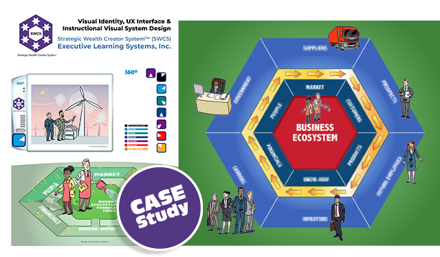
The Strategic Wealth Creator System™ is an executive-learning framework built around interconnected strategic processes. My role was to turn that complex material into a coherent visual system that could work across training, presentation, print and an interactive learning concept.
Role: Creative Director · Visual Systems Designer · Illustrator · Information Designer · UI/UX Concept Designer
The Brief
Turn a complex methodology into something people can navigate
The source material contained multiple interconnected strategic processes intended for business leaders and executive training. The design problem was therefore larger than illustrating individual concepts: the complete system needed an understandable visual structure.
Structure
Organise interconnected business concepts into a visual architecture that remains understandable across the full programme.
Consistency
Create one scalable visual language for identity, illustration, diagrams, navigation and presentation material.
Use
Support both printed teaching material and digital presentation while also exploring how the system could work interactively.
Visual Identity & Navigation
Six domains, one visual system
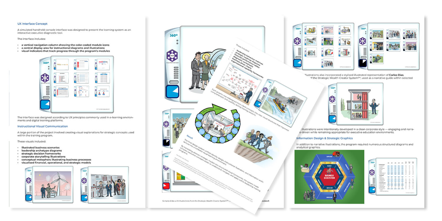
A central part of the work was creating an identity capable of representing the system’s six strategic domains. The hexagonal mark expresses the relationship between those parts, while colour coding provides an immediate navigational cue.
The same language was carried into training material, presentations, diagrams, interface layouts and other printed and digital applications so that users did not have to relearn the structure from one format to another.
UI/UX Concept
Exploring the system as an interactive learning tool
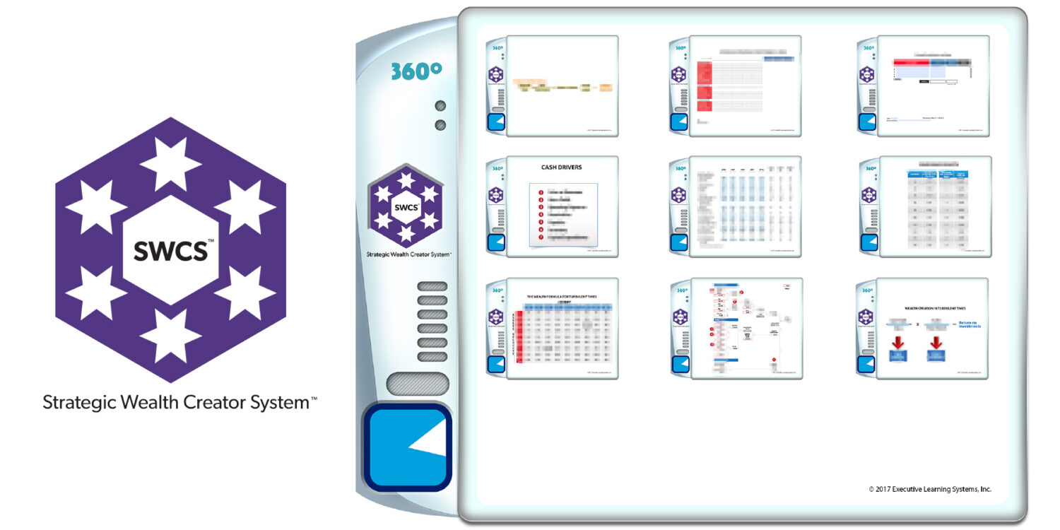
I also developed a simulated handheld interface as a concept for navigating the material interactively.
The concept used the same colour coding, domain structure and visual hierarchy as the wider system, with navigation, content areas and progress cues designed around the learning material rather than treated as a separate visual exercise.
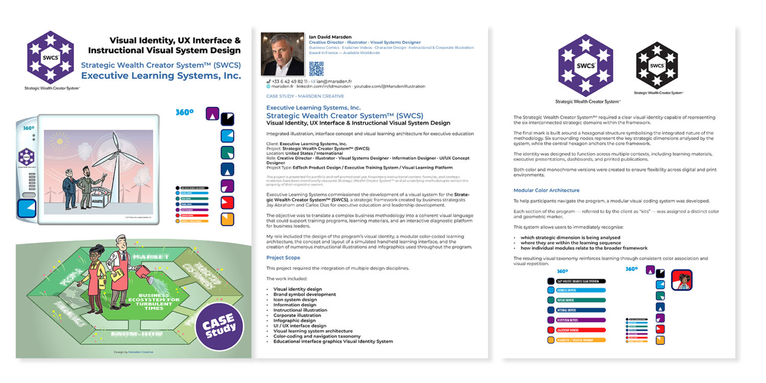
Illustration & Information Design
Different kinds of information needed different visual answers
Some ideas were best explained through scenes and visual metaphors; others needed diagrams, matrices, tables or structured frameworks. The aim was not to force every subject into the same format, but to keep the complete system visually coherent while choosing the clearest form for each piece of information.
Instructional Illustration
Business scenarios, process illustrations, visual metaphors and selected character-led sequences, including a stylised representation of Carlos Dias used within parts of the programme.
Information Design
Analytical diagrams, decision frameworks, business-driver models, financial tables, performance graphics, strategic roadmaps and other structured material developed from the client’s source content.
What Was Created
A single visual language across identity, teaching material and interface thinking
The completed work brought identity design, instructional illustration, information graphics and UI/UX concept development into one system. The same hierarchy and visual logic could therefore carry the methodology from one format to another without losing its structure.
Related Work
Illustration, visual systems and creative direction
New Work
Have a complex subject that needs a clear visual system?
If you are developing training material, a communication system or a project involving illustration, information design and several connected formats, send me a short outline of what you are working on.