
Parc Le Duc · Pic Saint-Loup · Illustrated Map · Wayfinding · Signage
Parc Le Duc — Illustrated Map, Wayfinding & Signage for a Dutch Holiday Park in France
A complete visual orientation system for Parc Le Duc in Vacquières, near Pic Saint-Loup: illustrated cartography, vector chalet drawings, custom icons, colour-coded sectors, multilingual safety information and large-format outdoor signage for an international holiday community.
Project overview
- Client: Parc Le Duc, Vacquières, Hérault, France
- Role: Designer · Illustrator · Environmental Graphic Designer · Visual Communicator
- Project: complete illustrated orientation and signage system
- Languages: French · Dutch · English
- Production: scalable vector artwork in Adobe Illustrator
- Applications: maps, outdoor panels, roadside totems, emergency information, print and digital communication
Turning a technical plan into something guests can actually use
The starting point was a black-and-white technical site plan. Accurate, certainly — but not something a newly arrived holidaymaker should have to decipher after a long drive south.
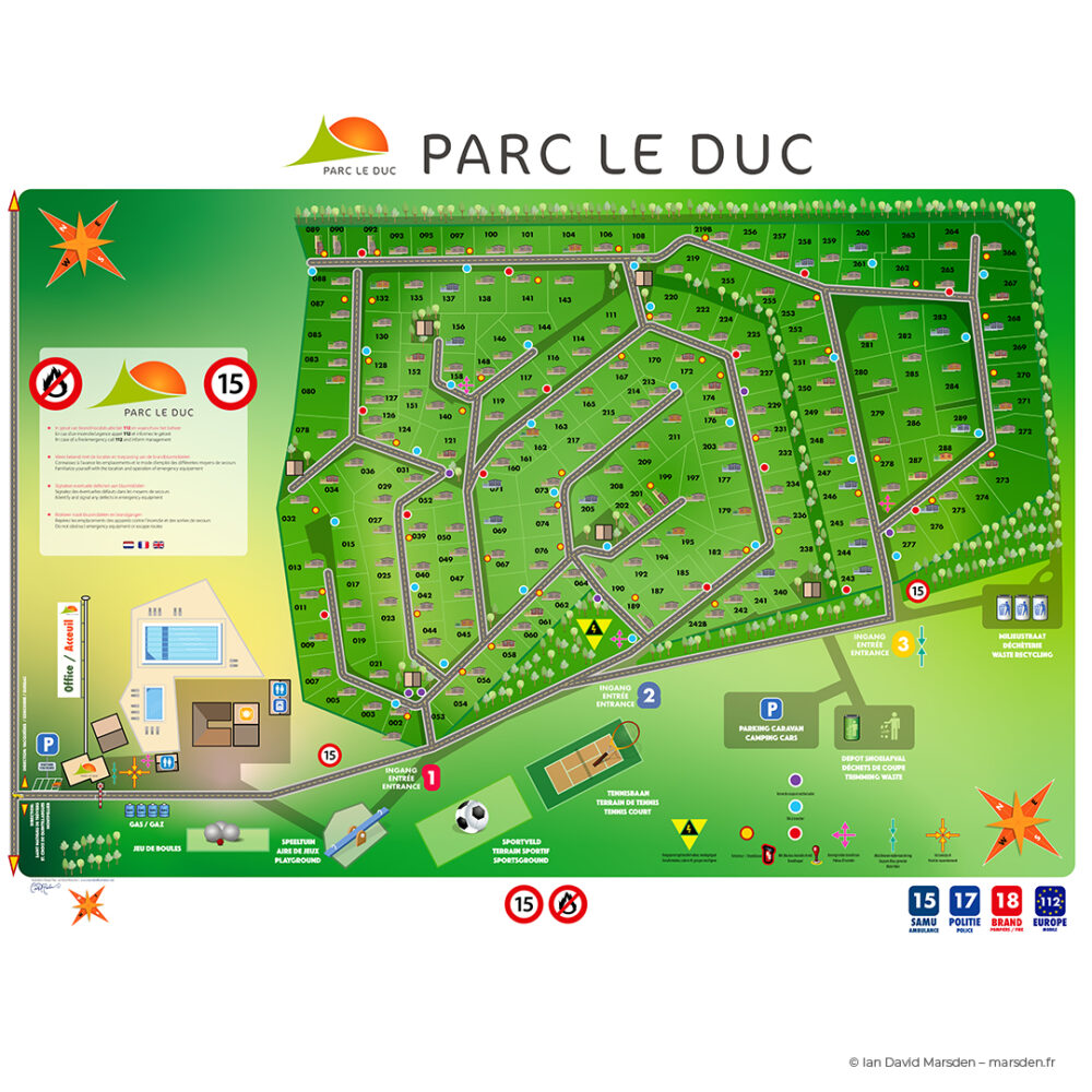
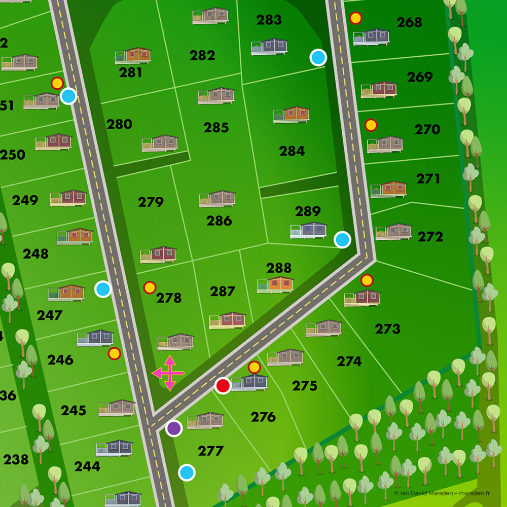
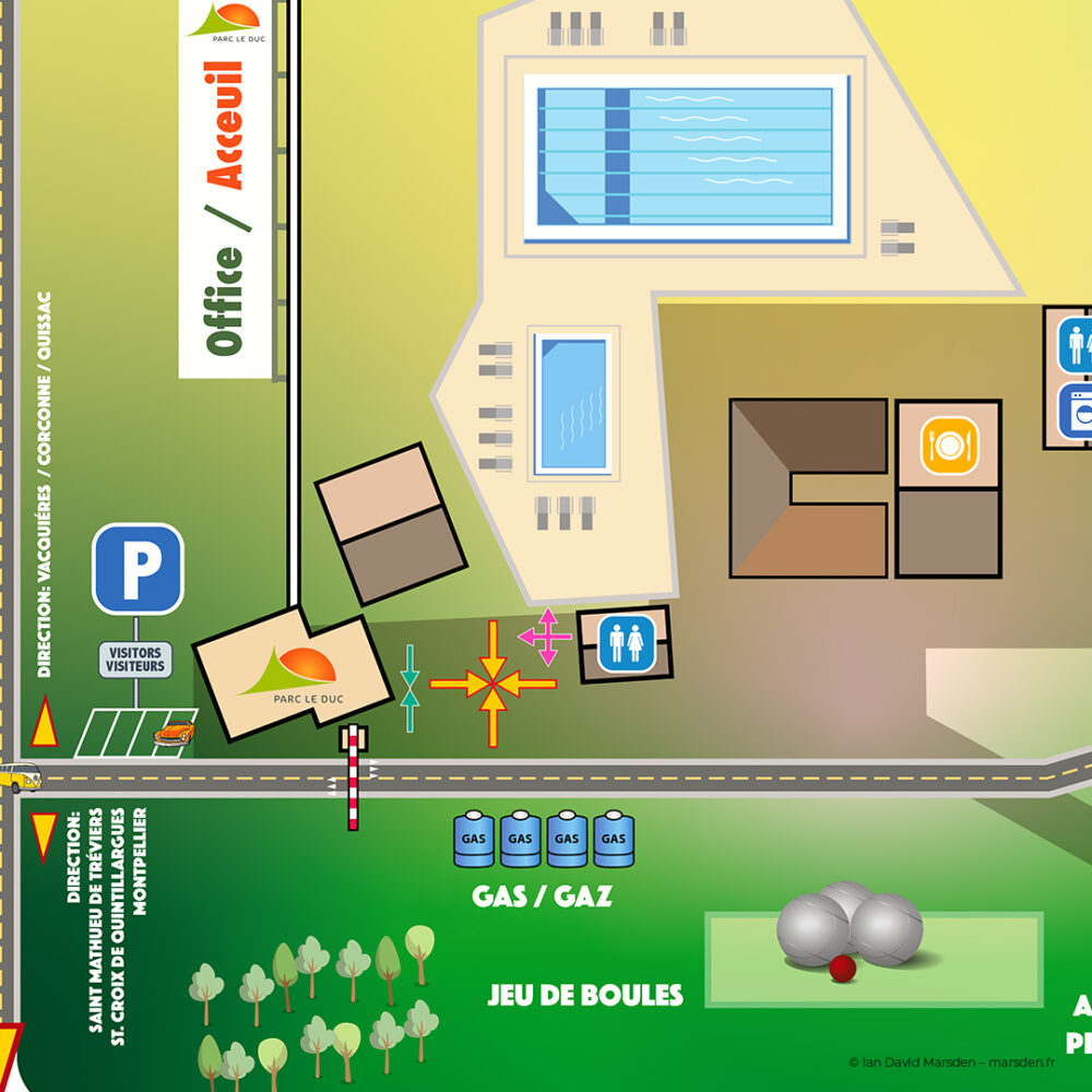
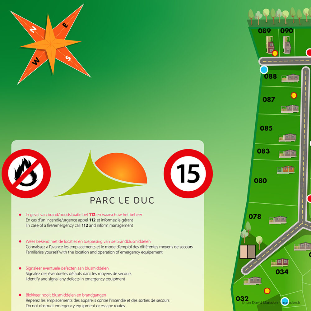
The task was to transform that source information into a clear illustrated map showing roads, chalet plots, reception, restaurant, swimming pools, parking, emergency points and other facilities at a glance.
That required more than drawing. It involved information hierarchy, cartography, illustration, typography, colour coding and wayfinding, all working together as one system.
Illustrated cartography & information design
The finished plan is fully vector based. Roads, plots, buildings, landscape elements, labels, icons and sector colours can therefore be edited independently and reproduced at anything from brochure scale to large outdoor signage.
One of the main design problems was deciding what not to show. A technical plan may contain a great deal of information, but orientation design succeeds through hierarchy. Guests need to understand where they are, where they want to go and which landmarks help them get there.
Colour-coded chalet areas, simplified roads and repeated visual landmarks create that structure without turning the map into a dense engineering diagram.
A Dutch holiday community in southern France
Parc Le Duc has an unusual and very specific identity: a Dutch holiday park in the south of France, set in the Hérault countryside near Pic Saint-Loup and Montpellier.
The privately owned holiday homes and chalets are used by an international community, with Dutch visitors and owners forming an important part of everyday life at the park. The reception is Dutch-speaking, while the setting, food, landscape and surrounding villages are unmistakably southern French.
That mix made multilingual communication a practical design requirement rather than an optional extra. French, Dutch and English all needed to coexist without turning every panel into a wall of text.
Custom icons instead of unnecessary text
A substantial part of the project was the development of a custom vector icon system for facilities, orientation and safety.
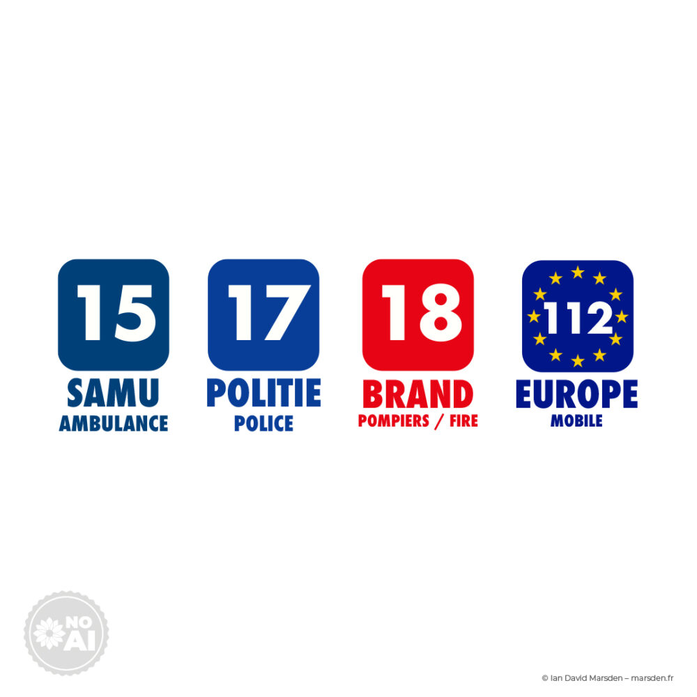
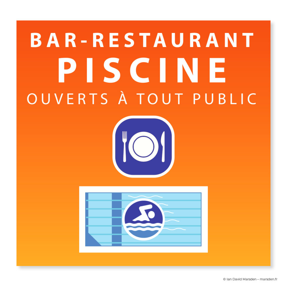
Symbols identify elements such as parking, swimming areas, emergency equipment, hydrants, meeting points and services without requiring visitors to read a sentence first.
For a park used by people speaking several languages, that kind of visual shorthand is particularly useful. Good pictograms reduce the amount of translation required while making repeated information easier to recognise around the site.
Even the chalets became part of the visual language
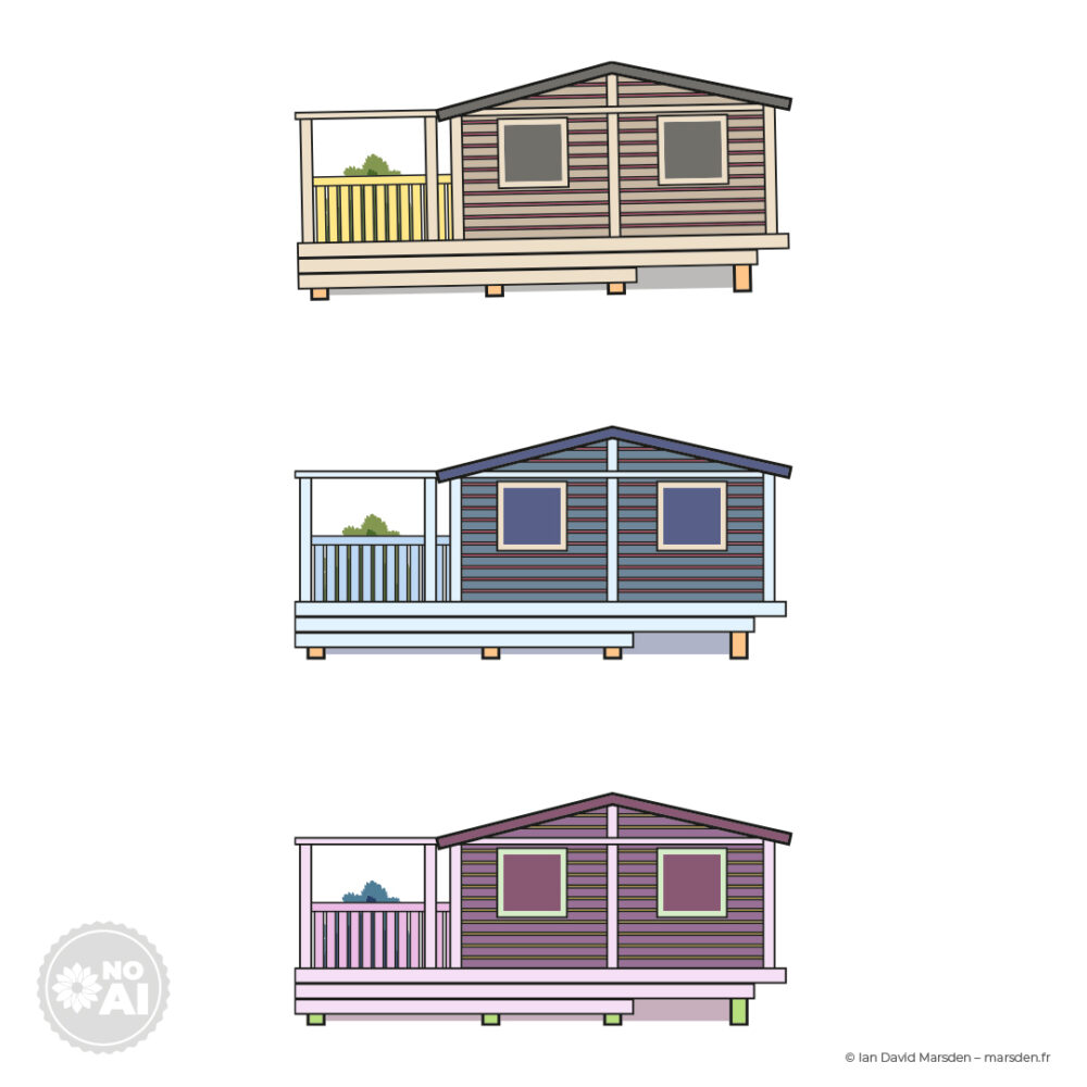
The buildings on the map are not generic house symbols. I created simplified vector illustrations of the different chalet types so that the architecture itself could help visitors understand the park.
Each drawing had to sit somewhere between architectural information and illustration: enough detail to make the type recognisable, but simple enough to remain clear when reproduced at small scale.
Because the cabins were built as vector assets, they could be reused throughout the map system and adjusted without redrawing them from scratch.
From map to physical wayfinding
The same design system was extended beyond the printed plan into the physical environment.
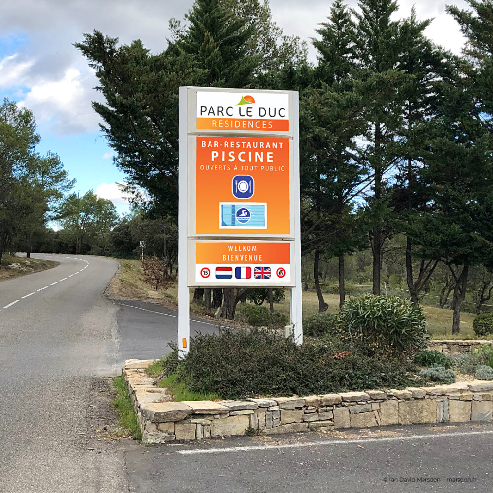
Large outdoor panels and roadside totems needed stronger hierarchy, larger typography and simplified information because visitors encounter them while walking, cycling or driving rather than studying a brochure.
The colour palette, icons and graphic language remain connected to the map, so guests do not have to learn a different system every time the format changes.
One project, many design disciplines
Parc Le Duc is a good example of a project that cannot be described accurately with a single label such as “map design.”
- Illustrated cartography — converting technical plans into an accessible visitor map
- Environmental graphic design — creating visual communication for a real physical site
- Wayfinding — helping visitors orient themselves and move through the park
- Vector illustration — scalable chalets, site elements and graphic assets
- Icon design — custom pictograms for facilities, services and safety
- Information design — organising complex spatial information into a readable hierarchy
- Multilingual communication — French, Dutch and English working within one system
- Signage design — adapting the visual language for outdoor and roadside use
- Production artwork — preparing scalable assets for print, signs and digital use
Designed locally in the Pic Saint-Loup region
Parc Le Duc is in Vacquières, within the same Pic Saint-Loup area where my studio is based today.
The park also sits within a broader visitor landscape that includes Pic Saint-Loup, Montpellier, Sommières, the Hérault valley and the Mediterranean coast — places that many of its Dutch and international guests come to explore during their stay.
For local businesses, domaines, tourism projects, associations and organisations around Montpellier and Pic Saint-Loup, I work across the same combination of illustration, graphic design and visual communication.
French location, Dutch audience, international communication
This combination is increasingly common in tourism and property projects: the physical location may be in France, while owners, operators or visitors come from the Netherlands, Belgium, Germany, the UK or elsewhere.
Projects like Parc Le Duc therefore benefit from communication that is visual first and language second. Maps, icons and clear information systems can bridge several audiences without requiring every message to be repeated three times.
For Dutch organisations or businesses with activities in France, I can develop illustration and visual communication remotely or directly from my studio in the Montpellier / Pic Saint-Loup region.
Related services
Graphic Design & Creative Direction →
Commissioned Illustration & Campaign Visuals →
Un projet de signalétique, cartographie ou communication visuelle ?
Pour un site touristique, domaine, entreprise ou lieu accueillant du public, envoyez-moi quelques informations sur le site, les publics concernés, les langues et les supports à prévoir.