
iSHEPHERD AG · TRM360 · Creative Direction · SaaS UX/UI · Brand Identity
iSHEPHERD TRM360 — Creative Direction, SaaS UX & Brand System
From July 2019 to August 2020, I worked as Creative Director for iSHEPHERD AG, developing the visual identity and communication system around its enterprise SaaS platform TRM360.
The work extended from the corporate identity into UX/UI design, iconography, illustration, animation, website structure, presentation design, marketing material and branded character development.
Project overview
- Client: iSHEPHERD AG
- Product: TRM360
- Period: July 2019 – August 2020
- Role: Creative Director
- Sector: enterprise SaaS · identity and access management · risk monitoring
- Scope: brand identity, UX/UI, iconography, illustration, animation, web, sales and marketing communication
Designing around a technically complex product
TRM360 addressed enterprise risk, permissions and entitlement monitoring within identity and access management environments.
That created a particular communication challenge: the platform dealt with abstract relationships between users, systems, permissions, risks and responsibilities, while the interface still had to remain understandable to people with different roles and priorities.
My task was not simply to style the software. It was to develop a coherent visual language around the product so that identity, interface, sales material and explanatory communication all felt like parts of the same system.
A genuinely multidisciplinary Creative Direction role
The engagement brought together several disciplines that are often handled separately:
- corporate identity and logo design
- visual brand system
- SaaS UX/UI design
- persona-based interface logic
- 64 custom vector UI icons
- illustration and visual metaphors
- mascot / character development
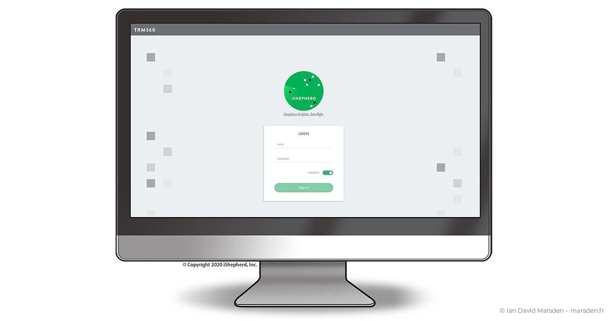
- animated interface and brand assets
- infographics and technical communication
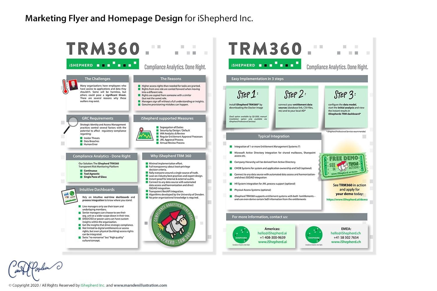
- sales decks and one-sheets
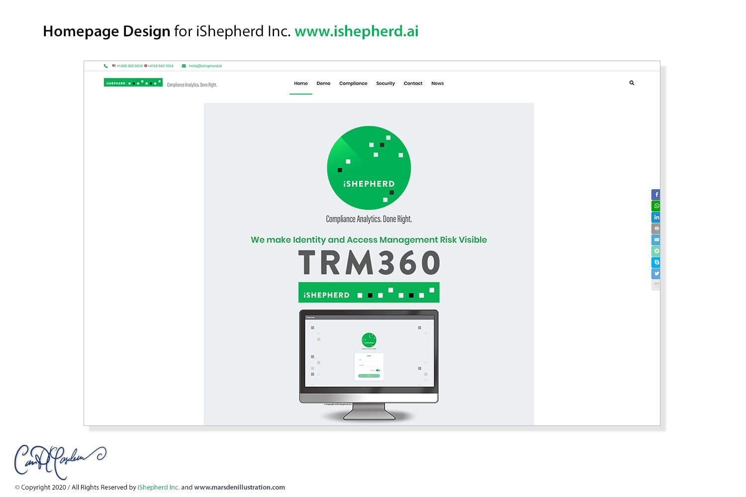
- website structure, wireframes and WordPress design
- branded event and promotional material
The advantage of handling these elements together was consistency: the product interface did not have to speak one visual language while the sales presentation, website and branding spoke another.
Brand identity built around monitoring
The visual identity centred on a circular, radar-like mark containing contrasting data points.
The idea connected naturally to the purpose of the product: watching patterns, identifying anomalies and bringing attention to events that require review.
The shepherd metaphor in the company name also offered a second visual layer — watching over a large and complex group without needing to inspect every element manually.
The identity was developed into horizontal and vertical configurations, colour specifications, typography, spacing and broader brand guidelines for use across digital and print material.
UX/UI for different enterprise roles
The TRM360 interface had to serve users approaching the same underlying information from different professional perspectives.
Personas included roles such as line managers, GRC analysts, auditors and system administrators.
The interface therefore used structured hierarchy, role-oriented colour cues, iconography and filters to help distinguish actions, risk information and system functions.
The objective was not visual decoration, but making a dense technical environment easier to scan and navigate.

64 custom UX icons
Rather than relying on a generic icon library, I designed a set of 64 vector interface symbols around the actual terminology and functions of TRM360.
The icons represented user actions, permissions, risk states, system components and other recurring interface concepts.
Working as a unified family meant balancing two requirements: every symbol needed to be individually understandable, while the complete set still had to look as though it belonged to one product.
Vector construction also allowed the icons to remain clean across different screen sizes and uses outside the interface.
Giving abstract software something visual to talk about
Enterprise compliance software is built around concepts that are difficult to photograph: permissions, risk, governance, anomalies, responsibilities and relationships between systems.
Illustration allowed those ideas to become more concrete.
I developed visual metaphors, infographics and character-led material that could be used in sales presentations, technical explanations, the website and other communication around the product.
The visual storytelling complemented the interface rather than competing with it: the product UI remained functional, while explanatory material could become more narrative and memorable.

The rocket sheep — character design within a B2B brand
The iSHEPHERD name made sheep imagery an obvious territory to explore — but it could easily have become predictable.
One of the recurring characters became a rocket-propelled sheep, giving the otherwise technical SaaS environment a more playful visual element for events, promotional material and branded objects.
This illustrates an important distinction in B2B communication: serious products do not always require every piece of communication to be visually severe.
Used in the right context, a character can add recognition and personality while technical documentation and interface design remain appropriately restrained.

Website, sales decks & enterprise communication
The visual system continued outside the SaaS product itself.
I worked on website structure, wireframes and the WordPress homepage, alongside material used to explain and present TRM360 to enterprise audiences.
- website structure and homepage design
- sales and presentation decks
- technical one-sheets
- infographics
- UI overview material
- corporate stationery
- business cards
- event graphics and branded promotional items
This meant the same underlying visual identity could follow the product from first presentation through to the actual interface.
Creative Direction across product, brand & communication
What made iSHEPHERD particularly interesting was the breadth of the assignment.
The same project could require thinking about a dashboard hierarchy in the morning, a set of vector icons later in the day, then an illustrated sales metaphor, website section or animated login asset.
Those tasks look very different in isolation, but Creative Direction is largely about making sure they are answering the same underlying questions: who is using this, what needs to be understood, and how should the organisation look and sound while communicating it?
Disciplines applied to the project
- Creative Direction
- Brand Identity
- Logo Design
- SaaS UX/UI Design
- Information Architecture
- UX Icon Design
- Business Illustration
- Character & Mascot Design
- Infographic Design
- Animation & Motion Assets
- Presentation Design
- WordPress / Web Design
- Visual Communication
Visual communication for SaaS & complex B2B products
Projects like TRM360 sit at the intersection of product design and communication.
A technically complex product may need more than a functioning interface. It may also require an identity, custom icon system, diagrams, sales visuals, explanatory illustrations, presentation material and a website capable of communicating the product to people who are not using it yet.
My work across illustration, design and Creative Direction is particularly useful in that kind of situation because the visual elements can be developed together rather than as unrelated layers added at different stages.
iSHEPHERD — full Case Study
The downloadable case study provides a compact visual overview of the identity, UX/UI system, iconography and wider communication work.
Related services
Graphic Design & Creative Direction →
Commissioned Illustration & Campaign Visuals →
Logo, Mascot & Character Design →
Building a visual system around a complex product?
If you have a SaaS, technology or B2B project in mind, send me a brief outline of the product, audience and communication challenges. I can work across identity, visual storytelling, interface concepts, iconography and wider Creative Direction.