Top Source Wine Label Redesign — A New Visual Identity for Three Washington State Wines
In 2025, Top Source asked me to revisit the visual identity of its Washington State wine range: Walla Walla Valley Syrah, Columbia Valley Syrah-Grenache and Columbia Valley Sauvignon Blanc.
I had designed the earlier labels for these wines in previous stages of the project. They already had a light, painterly and hand-drawn character, but one inherited element had continued to sit somewhat uneasily above them: the original Top Source brand treatment, presented in a heavy black header band with very utilitarian lettering.
It was clear, visible and difficult to miss. Those are not always virtues. Against labels built from expressive marks, brushwork and handwritten wine names, the black strip felt too blunt. It suggested a more basic, budget-facing product language than the wines deserved, and at shelf distance it risked reading almost like an external store marker — “TOP SOURCE” as a retail designation — rather than the name of a serious Washington wine brand.
The redesign therefore began not by changing the wines themselves, but by removing the obstacle that was preventing the labels from becoming a more coherent family.
Removing the black band and rebuilding the brand presence
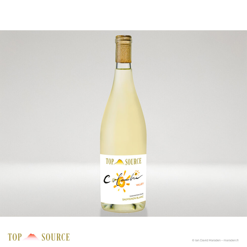
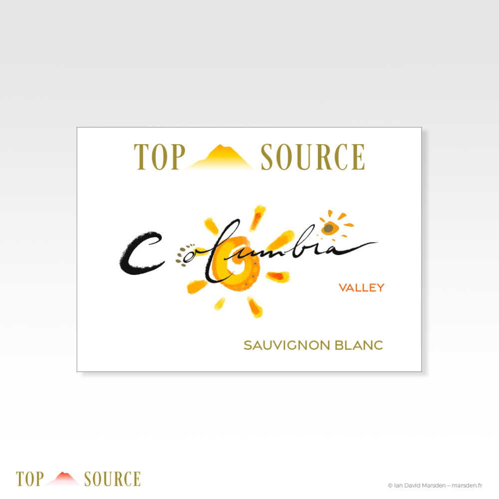
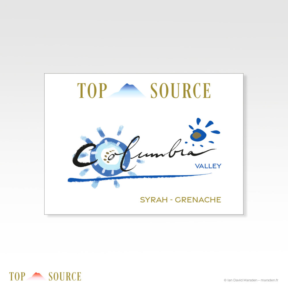
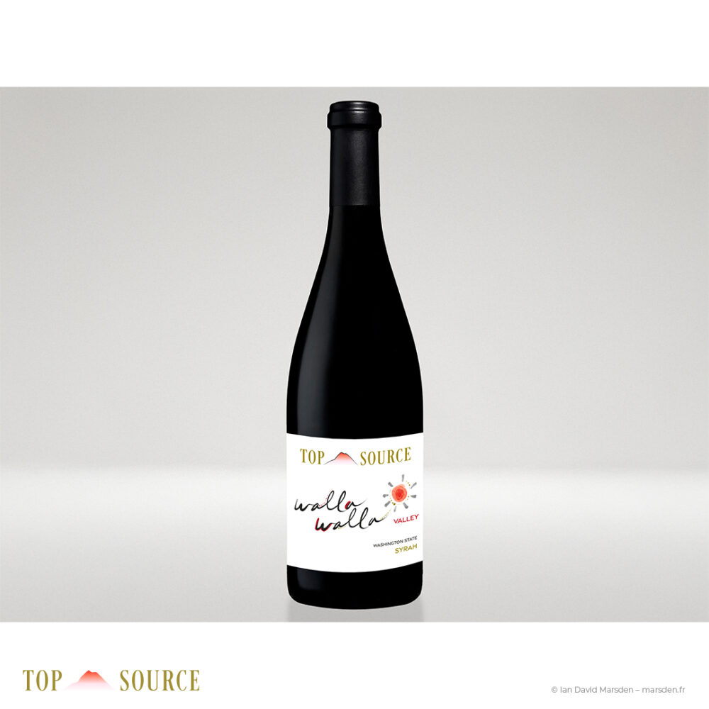
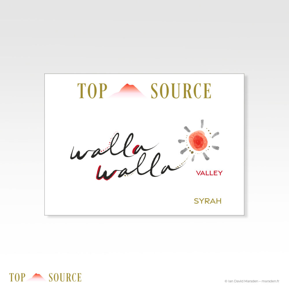
The first decision was to eliminate the dark top strip entirely. This immediately allowed the labels to breathe. It opened the upper portion of the bottle, gave the central artwork more dignity, and made room for a new Top Source logotype that could feel genuinely part of the same visual world.
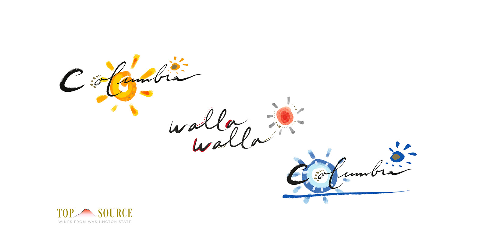
I developed a new Top Source brand mark built around a clean serif wordmark and a mountain silhouette associated with Washington State. The revised identity is quieter, more assured and better suited to wines of this quality. It remains present on every label, but no longer dominates them by force. Printed in gold foil, it adds distinction and continuity across the full range without weighing the composition down.
This was the key shift in the project: the brand was no longer something placed on top of the labels. It became a framework within which the labels could properly live.
Refining the individual wine identities
With the brand structure resolved, I returned to the three existing label designs and gave each one a more focused, more finished identity of its own.
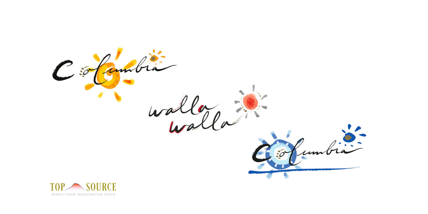
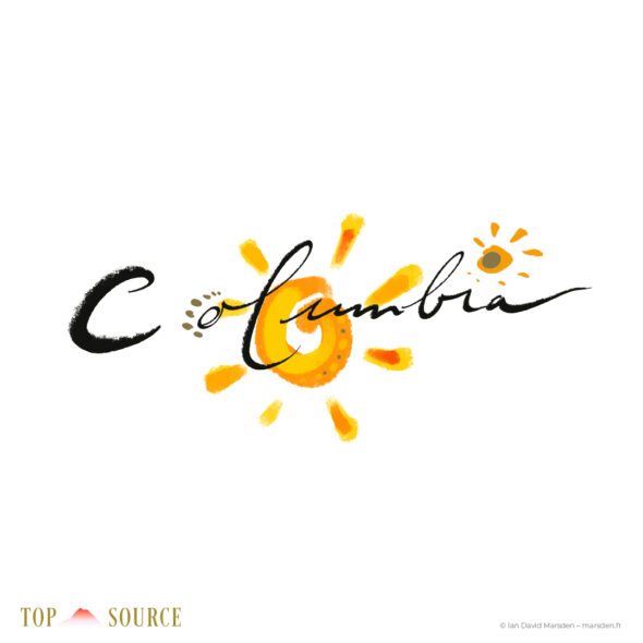
Each wine now has a distinct handwritten title treatment, accompanied by a small solar motif developed in the same painterly language. These marks do not operate as generic decorative flourishes. They help give each wine its own rhythm and visual temperature while maintaining a clear family relationship across the range.
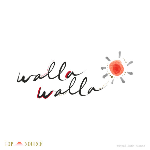
- Walla Walla Valley Syrah retains a warm red visual register, with a freer, gently looping wordmark and a small radiant sun form that echoes the label’s expressive movement.
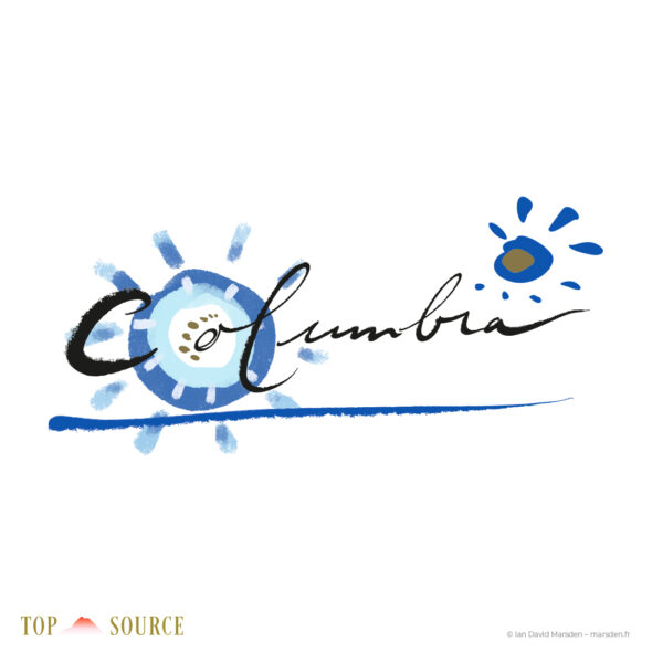
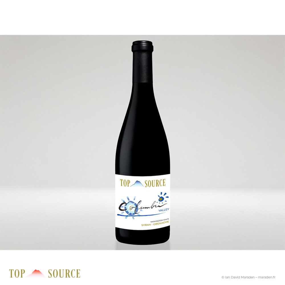
- Columbia Valley Syrah-Grenache shifts into a cooler blue palette, balancing a broad horizontal brush stroke with a more expansive handwritten logo.
- Columbia Valley Sauvignon Blanc becomes brighter and more open, built around a vivid yellow-orange sun and a warmer, more luminous Columbia treatment.
The three designs are not identical, nor should they be. They correspond to different wines. But they now speak with related accents rather than entirely separate dialects. Seen together, the range feels deliberate. Seen individually, each bottle still has a distinct personality.
A range designed to hold together — and to stand apart
Wine shelves are crowded places. A label has only a short moment to establish whether it belongs to the anonymous mass of acceptable packaging or whether there is an actual sensibility behind it. The aim here was not to make Top Source louder, but more unmistakably itself.
The redesigned range balances three layers:
- a refined and consistent Top Source master brand;
- individual hand-drawn identities for each wine;
- a shared label architecture that lets the bottles work beautifully as a family on shelf, in retail material and in presentation.
The gold foil Top Source mark now gives the line a steadier sense of provenance. The handwritten wine names carry the more human, expressive side of the design. The painterly sun symbols and restrained color systems give each label a memorable point of entry. Together, they create a range that feels premium without becoming mannered, artistic without losing clarity, and more aligned with the quality of the wines themselves.
From inherited packaging to a stronger visual system
I especially enjoy projects of this kind because they are not about starting from a blank sheet of paper. They are about looking carefully at what already exists, identifying where the visual logic is breaking down, and improving the system without erasing the strengths that were there from the beginning.
In this case, the original hand-drawn label language had value. It was individual, fresh and far removed from generic wine packaging. The redesign allowed that quality to come forward more clearly by giving it a brand identity of equal care and confidence.
The result is a renewed Top Source range that feels more coherent, more distinctive and much better prepared to hold its own among other serious wines — not by shouting over them, but by presenting itself with greater composure.
Project scope
- 2025 redesign of the Top Source Washington State wine label range
- Removal of the earlier black header band and restructuring of label hierarchy
- Creation of a new Top Source logotype and mountain brand mark
- Gold-foil master brand treatment across all labels
- Refinement of three individual wine identities
- Handwritten logo treatments for Walla Walla Syrah, Columbia Syrah-Grenache and Columbia Sauvignon Blanc
- Visual harmonization of the range for shelf presence and family consistency
- Label artwork and presentation mockups for the redesigned bottles
Project credits
- Client: Top Source
- Wines: Walla Walla Valley Syrah, Columbia Valley Syrah-Grenache, Columbia Valley Sauvignon Blanc
- Region: Washington State, USA
- Project: Wine label redesign and visual identity refinement
- Creative direction, logo development and label redesign: Ian David Marsden
- Year: 2025
Related wine and drinks label projects
Some of my other featured wine and drinks label projects include Roc de Couder, an illustrated Pic Saint-Loup wine label for Mas de Figuier, Domaine Les Tuileries, a hand-drawn wine label and winery logo project developed for the US market, and a series of illustrated wine and drinks labels created in the Pic Saint-Loup region.
More broadly, I work on packaging design, logo and identity projects, and custom wine and drinks labels for producers who want packaging with a more individual visual language.
Wine label redesign and packaging identity
I design and refine wine labels, packaging identities and illustrated drinks branding for producers in the United States, France and internationally. Some commissions begin with a completely new label system. Others ask for a more delicate task: taking a promising existing range and helping it become the version of itself it was trying to be all along.