Henkel · BREF · GENERAL · Packaging Illustration · Information Design
Henkel BREF & GENERAL — Instructional Product Illustration for Packaging
Commissioned through Rock Brasiliano in Hamburg, I created a series of vector instructional illustrations for Henkel’s BREF and GENERAL cleaning-product lines, explaining product application, cleaning action and functional benefits through clear visual sequences.
The project combined information design, product illustration, packaging communication and visual instruction for use across consumer-facing formats.

Project overview
- End client: Henkel
- Brands: BREF / GENERAL
- Commissioned by: Rock Brasiliano – Communications & Corporate Innovation
- Art Direction: Stephan Eisenblätter
- Illustration: Ian David Marsden
- Location: Hamburg, Germany
- Period: July 2015
- Duration: approximately one week
- Production: vector illustration in Adobe Illustrator
Explaining product use visually
The brief involved more than drawing attractive packaging graphics.
The illustrations had to explain what the product does, how it is applied and what happens during use — often within very limited space.
That meant reducing practical cleaning processes to a sequence of immediately readable visual cues: pour, place, brush, scrub, dissolve, rinse and compare.
The imagery also needed to support multilingual packaging, where visual information can reduce the amount of explanatory text required on-pack.

A compact visual language for cleaning products
The system combined several kinds of information within the same illustration style:
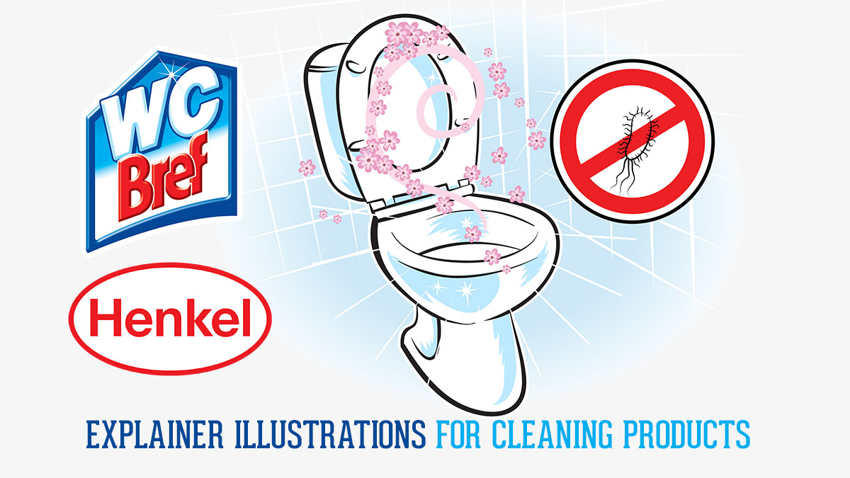
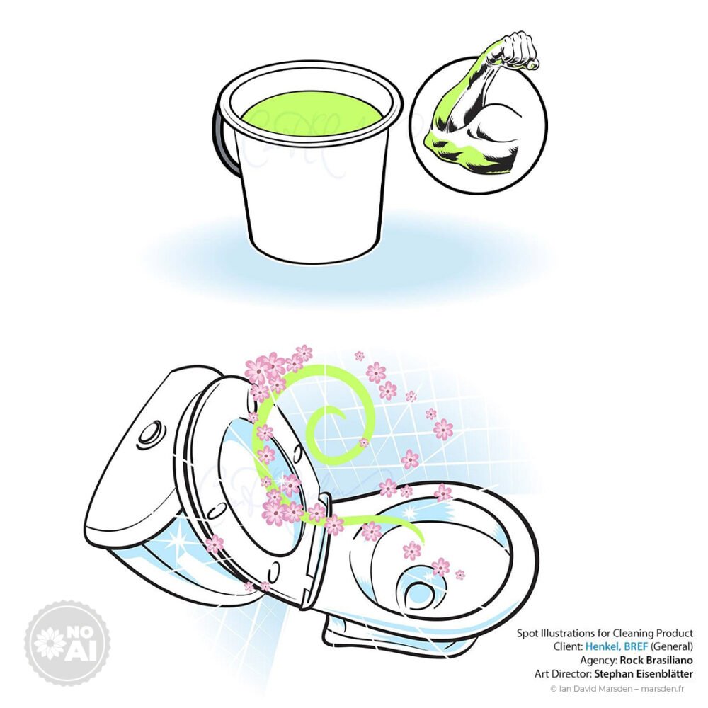
- cutaway diagrams of toilets, bowls and drains
- step-by-step actions such as pouring, placing tablets and scrubbing
- dirt and bacteria symbols for limescale, deposits and microbial presence
- effect cues such as foam, movement arrows, sparkles and fragrance swirls
- functional pictograms including protection and before/after concepts
- hands and gloves simplified for fast recognition
The challenge was to keep all of this understandable without allowing the diagrams to become visually crowded.

Information design before decoration
Instructional illustration works best when every element has a purpose.
A hand indicates the action. An arrow shows direction. A cutaway reveals what is happening inside. Bubbles or sparkles communicate an effect. A simplified microorganism symbol identifies the problem being addressed.
The drawing style therefore had to remain clean enough that these visual signals could be understood quickly on packaging, instructions and promotional material.
In this kind of work, clarity is part of the illustration itself.

Designed for multilingual packaging
Household products are frequently sold across several markets, so packaging often has to accommodate multiple languages within a very small area.
Illustration can help by carrying part of the instructional burden visually.
The goal here was not to remove written information entirely, but to make the basic action and product effect understandable before the consumer reaches the supporting text.
That is particularly useful for step-by-step usage, directional information, comparisons and simple functional claims.

Vector artwork built for packaging production
The illustrations were created as vector artwork in Adobe Illustrator.
This made the drawings practical for a range of production requirements, from small packaging panels to larger point-of-sale graphics.
Vector construction also made it easier to keep lines, symbols and simplified product shapes consistent across a family of illustrations.
Deliverables included editable vector files and preview artwork prepared for the agency workflow.

From packaging to point of sale
The illustration system was intended to work across several consumer and trade-facing formats, including:
- product packaging
- bottles and sachets
- back-of-pack instructions
- folded usage and cleaning instructions
- point-of-sale graphics
- shelf communication
- trade-facing material
- distributor and retail communication
The same visual vocabulary could therefore move between a small instruction panel and a much larger retail application without changing the basic message.
Commissioned through Rock Brasiliano
The project was commissioned by Rock Brasiliano – Communications & Corporate Innovation for Henkel.
I worked directly with Stephan Eisenblätter on the illustration brief and art direction, developing the artwork within the wider communication requirements of the BREF and GENERAL product families.
The complete series was produced within a concentrated one-week production period in July 2015.
Instructional illustration for products & packaging
This type of work sits between illustration and information design.
A consumer may need to understand an action, a sequence, a product effect or a comparison in just a few seconds. The image therefore has to be both technically useful and visually controlled.
The same approach can be applied to household products, tools, appliances, healthcare products, technical equipment and other situations where usage needs to be explained visually.
Disciplines applied to the Henkel project
- Instructional Illustration
- Product Illustration
- Information Design
- Packaging Illustration
- Vector Illustration
- Pictogram Design
- Step-by-Step Visual Communication
- Multilingual Consumer Communication
Henkel — full Case Study
The downloadable PDF provides a compact visual overview of the BREF / GENERAL instructional illustration project.
Related services
Commissioned Illustration & Campaign Visuals →
Editorial & Educational Illustration →
Need to explain a product visually?
If your product requires clear application steps, diagrams, packaging instructions or visual explanations, send me a brief outline of the product, audience, markets and required formats. I can develop a scalable illustration system for print and digital use.