Top Source · Wine Label Design · Columbia Valley · Washington State
Top Source Sauvignon Blanc — Wine Label Design for Columbia Valley
A bright, hand-drawn identity for Top Source Columbia Valley Sauvignon Blanc, developed within a broader Washington State wine-label system combining custom lettering, painted motifs and a refined master brand.
Client: Top Source · Region: Columbia Valley, Washington State, USA
Role: Creative Direction · Wine Label Design · Hand Lettering · Brand Identity
The Wine
A lighter expression within the Top Source range
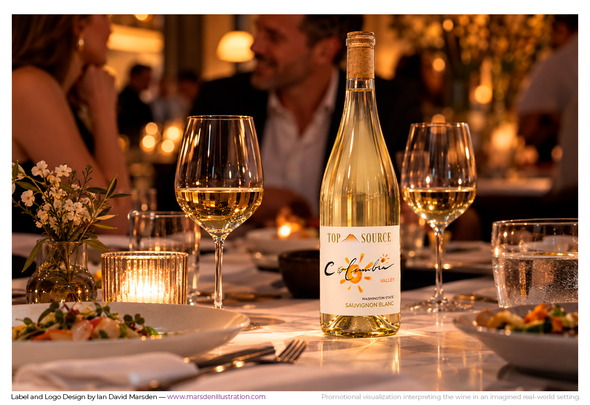
The Sauvignon Blanc needed to belong unmistakably to the same Top Source family as the red wines while feeling brighter, more open and more appropriate to the character of a white wine.
Rather than treating it as a completely separate design, I used the same basic visual grammar: a consistent Top Source master brand, expressive regional lettering and a painted motif that gives the individual wine its own recognition.
The result is part of the range at first glance, but it does not feel like a color-swapped version of one of the reds.
Visual Direction
Hand lettering, painted color and a more luminous identity
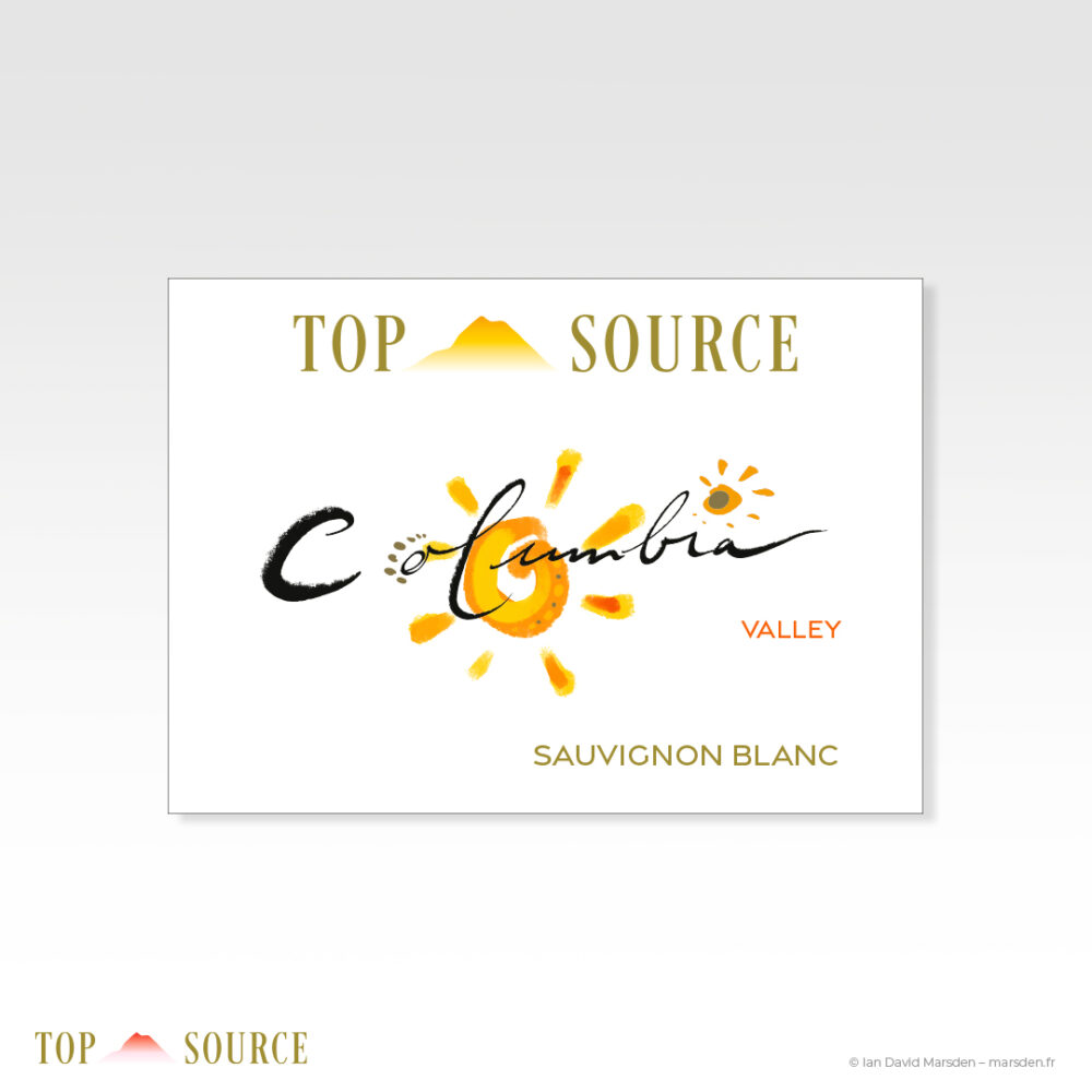
The hand-drawn Columbia lettering remains one of the strongest identifying elements. Behind it, a painted yellow-orange sun gives the Sauvignon Blanc its warmer and more luminous visual register.
The irregularity of the lettering and painted mark is intentional. They provide a human counterpoint to the more controlled Top Source wordmark and mountain symbol, allowing the label to feel authored rather than mechanically standardized.
Metallic gold detailing then ties the bottle back into the wider packaging system while adding a more refined material accent.
Range Architecture
Individual character inside a shared system
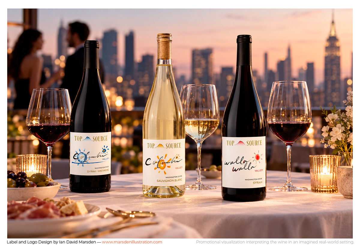
The Sauvignon Blanc is one of three Top Source wines developed within the redesigned packaging system, alongside Columbia Valley Syrah-Grenache and Walla Walla Valley Syrah.
All three share the same Top Source master brand and label architecture, but the regional lettering, painted motifs and color registers are allowed to change. The system creates recognition without forcing uniformity.
For a wine range, that balance is important: the bottles should look related on a shelf or table, while each wine still has a reason to be remembered individually.
The Wider Project
Part of the Top Source wine-label redesign
The Sauvignon Blanc sits within a broader redesign of the Top Source range. The project included removing an older, heavier brand header, developing a quieter master identity with the Top Source mountain symbol and rebuilding the hierarchy across all three wines.
The complete case study looks at the relationship between master brand, hand-drawn wine identities, metallic detailing and range recognition across Columbia Valley and Walla Walla Valley.
Project Details
Client: Top Source
Wine: Columbia Valley Sauvignon Blanc
Region: Washington State, USA
Project: Wine label design within a three-wine packaging system
Creative contribution: Creative direction, master-brand development, hand lettering, label design and presentation artwork
Related wine, design & illustration work
Top Source Wine Label Redesign →
Domaine Les Tuileries — Hand-Drawn Wine Identity →
Roc de Couder — Pic Saint-Loup Wine Label →
Graphic Design & Creative Direction →
Wine Label · Packaging · Identity
Developing a new wine or extending an existing range?
I work across graphic design, illustration, hand lettering and creative direction to develop distinctive wine labels, packaging identities and coherent visual systems for individual wines and complete ranges.