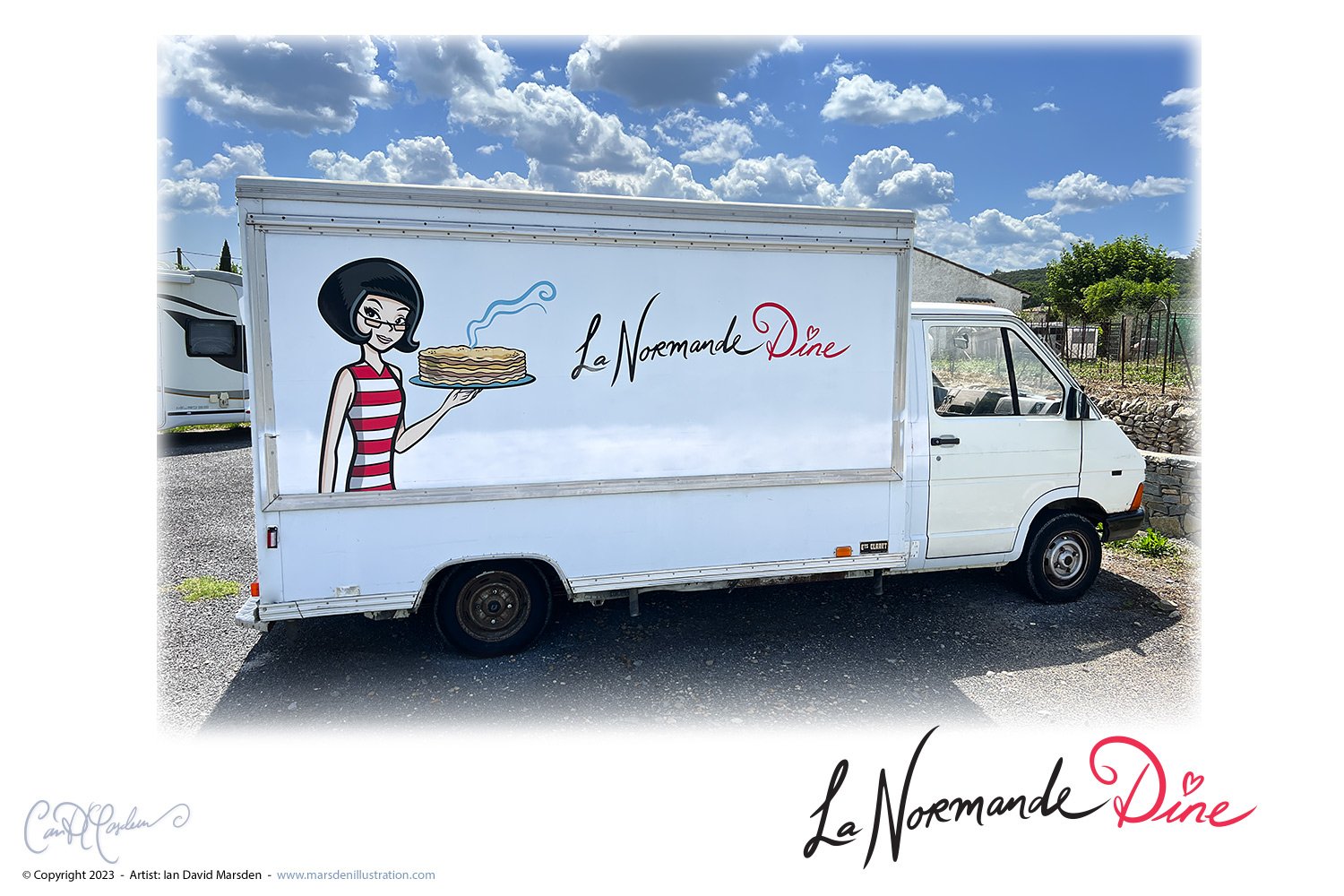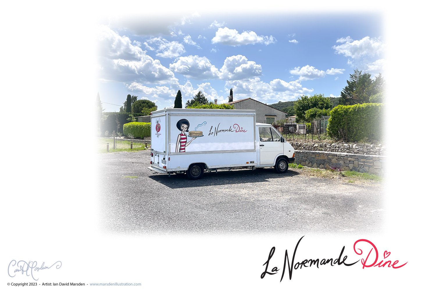
Hello, fellow design enthusiasts and crepe and galette lovers! It’s Ian David Marsden once again, taking you on another delightful journey through the design process of one of my favorite projects: the logo for “La Normande Dine”.
When you think of Montpellier and the Pic St Loup region, it’s easy to get lost in the visual design choices between modern French Tech and old-world charm. Diving deeper into the essence of “La Normande Dine”, what truly added depth and flavor to this design venture was the authenticity at its core. The crepes and galettes aren’t just inspired by Normandy – they are the real deal, genuine Normandy delights.

It’s one thing to create a logo for a brand, but it’s another to encapsulate the soul of a true native of La Normandie. Nathalie isn’t just a master chef; she’s a living testament to the region’s culinary legacy. Designing for such genuine authenticity posed both a delightful challenge and a unique privilege. It wasn’t merely about aesthetics, but about honoring a rich tradition and an individual’s true passion
The inspiration for “La Normande Dine’s” logo was drawn straight out of the groovy sixties. Retro is always in style, isn’t it? And combining it with the rustic, heartwarming allure of crepes is like marrying the Beatles with crème brûlée!

But let’s dive deeper.
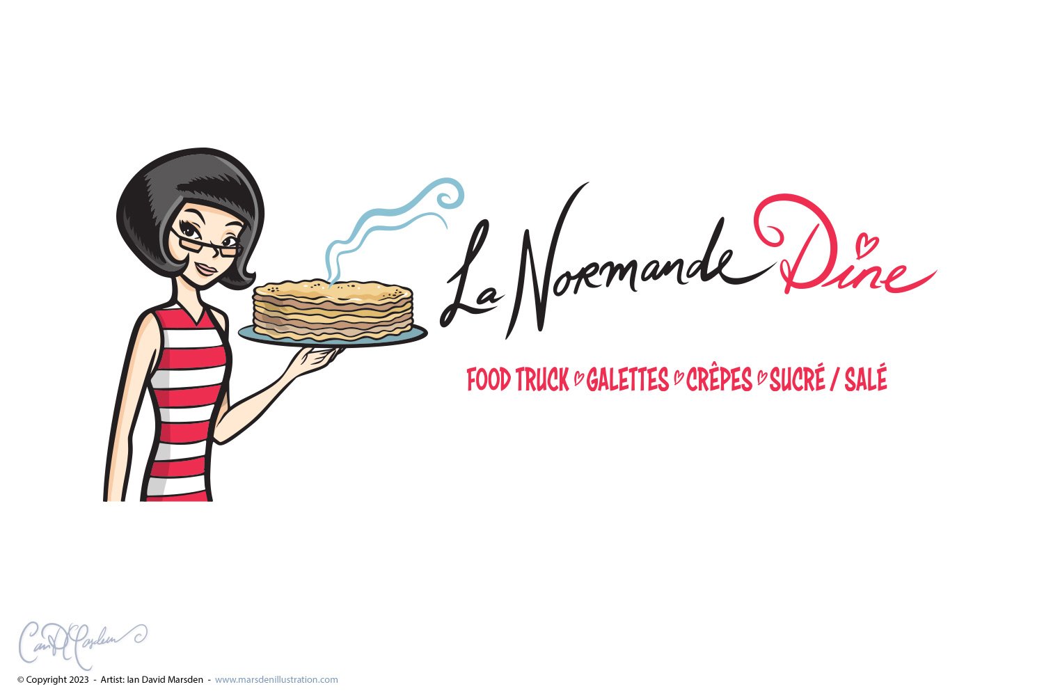
Nestled in the heart of the design, with whimsically handwritten letters spelling out the name, is a character that’s bound to catch your eye. Meet Nathalie – the master crepes chef behind all those scrumptious stacks. Ah, and yes, those trademark glasses and distinctive hairstyle! It’s a visage many in the Pic Saint-Loup region recognize and love. Yet, as a designer, I aimed to stylize her image, turning her almost into an icon. The resulting portrait, rendered in clean vector art, almost in a ligne-claire BD style, captures her charm while keeping it chic and modern.
There she is, gazing at us through her glasses with a smile, presenting her masterpiece – a stack of delicious Norman crepes, oozing authenticity and flavor. It’s an invitation, a beacon for all those with an appetite for both design and delectable food.
Every logo has a story to tell, and “La Normande Dine’s” logo is a tantalizing tale of retro allure, culinary passion, and a dash of designer’s magic.
So, the next time you’re wandering the streets or the markets of Sommieres, Vacquieres, Claret, or any of the numerous picturesque locations around the Pic Saint-Loup mountain in the Hérault part of the Languedoc north of Montpellier, and you spot this emblem, you’ll know the story behind it. Do drop by, give Nathalie a wave, and treat yourself to some Norman delicacies. After all, good food and great design are what life’s all about!
La Normande Dine, Retro Logo Design, Montpellier Food Truck, Ian David Marsden Designs, Normandie Crepes, Vector Art Portrait, Food Truck Branding, Whimsical Handwritten Design, Pic St Loup, Normandy in Montpellier, Languedoc Culinary Design, Galette Food Truck Art, Illustrateur Montpellier, Graphiste Montpellier

