Visual Architecture for a Professional Software Engineering Training Tool
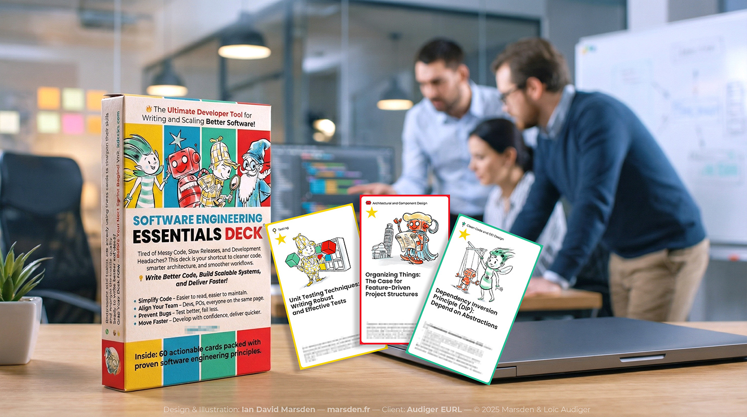
In 2025, I collaborated with Loïc Audiger (CTO, Audiger EURL) to develop the visual identity and instructional framework for a professional software engineering training product: a 59-card deck designed to teach core principles of modern development practice.
The training content and sequencing were already defined. My job was to build a visual system that could make abstract concepts legible and usable at a glance—supporting comprehension, navigation, and retention across topics such as Domain-Driven Design (DDD), refactoring cycles, and Test-Driven Development (TDD). The goal was a tactile learning tool that felt coherent, production-ready, and scalable to future digital use.
Strategy: instructional UX and a visual taxonomy
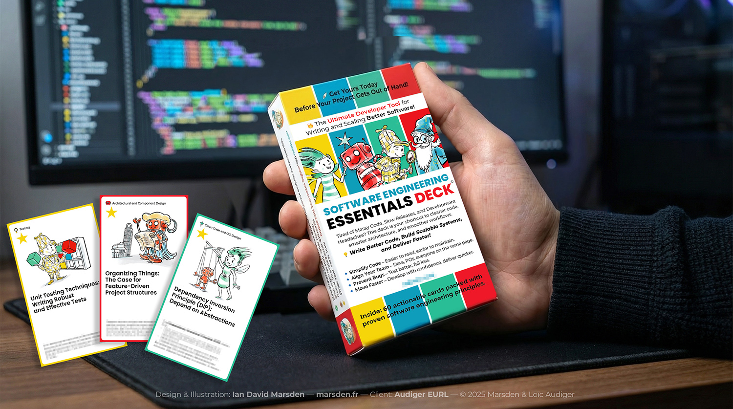
A deck only works if the user can orient themselves instantly. I designed a modular, four-pillar taxonomy that functions as a mental map: consistent color coding, a character anchor per pillar, and an icon system that tags concepts without adding reading load.
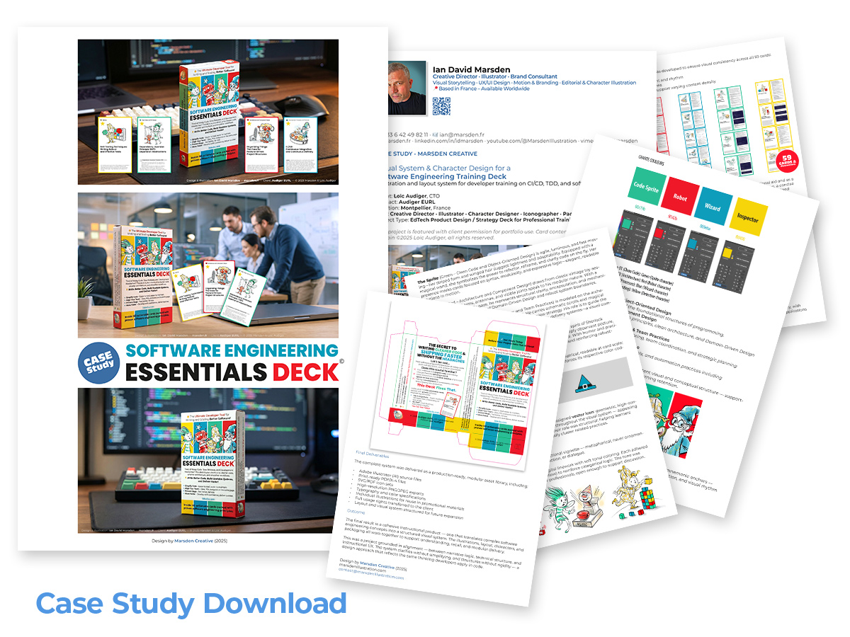
The four pillars were structured as follows:
- Foundations (Green) — The Sprite: core syntax, logic, and fundamental building blocks
- Architecture (Red) — The Robot: structural modeling, system thinking, and DDD patterns
- Process (Blue) — The Wizard: iteration cycles, continuous improvement, and operational frameworks
- Quality (Yellow) — The Inspector: testing logic, automation, and reliability practices
This approach treats visual design as instructional UX: the user should understand “where they are” before they even read.
Character design as applied abstraction
The characters were designed as functional metaphors rather than mascots. The constraint was coherence: a consistent vector rendering approach, uniform line logic, and a shared visual “physics” so the system reads as one family across 59 cards.
For the card fronts, I illustrated 59 individual scenes as clear narrative beats within the learning path. Each image balances immediate foreground readability with intentionally restrained background information—enough context to support meaning, not enough noise to compete with the concept.
All illustrations were built in Adobe Illustrator, keeping the entire asset set fully scalable for print production, packaging, and potential digital extensions (web, slide decks, interactive learning modules).
Technical production and pre-press engineering
Beyond illustration, I delivered the complete product identity and print production package. This included the external étui (card box), a bespoke icon set for navigational tagging, and final print-ready deliverables aligned to manufacturing constraints.
Working from production specs, I executed the final die-cut files and managed:
- dielines, bleed zones, and safety areas for packaging and cards
- print-consistent color handling across the system
- a structured asset library designed for iteration and reuse
Final delivery included:
- Vector-native source files (AI) with structured layers
- Print-ready PDF/X-4 files for high-fidelity offset production
- Icon sets in SVG and PDF for flexible deployment
- Color and typography guidelines to preserve consistency across future formats
Outcome
This project sits at the intersection of technical illustration and learning design: visual storytelling aligned with engineering logic. The result is a structured, tactile interface for abstract thinking—built to support developer education, training materials, and modular learning systems.
Detailed case study
If you’d like the full methodology and technical breakdown, you can download the complete documentation here:
Download the Software Engineering Essentials Case Study (PDF)